Objective
To develop a brand strategy, creative platform, and visual and verbal identity that would position Casa Tierra Cobriza as a credible and prestigious tequila producer in international markets. The challenge was to build the authority traditionally associated with historic distilleries without relying on a legacy the company had yet to establish, while creating a corporate identity capable of representing its own portfolio of brands and its contract manufacturing business.
Solution
Our strategic research revealed how deeply the tequila industry relies on heritage and generational history to establish credibility. We identified an opportunity to challenge this convention, positioning Casa Tierra Cobriza around its Mexican origins, technical expertise, and commitment to quality. Rather than borrowing authority from the past, the brand would establish its own through knowledge, precision, and a forward-looking approach to tequila production.
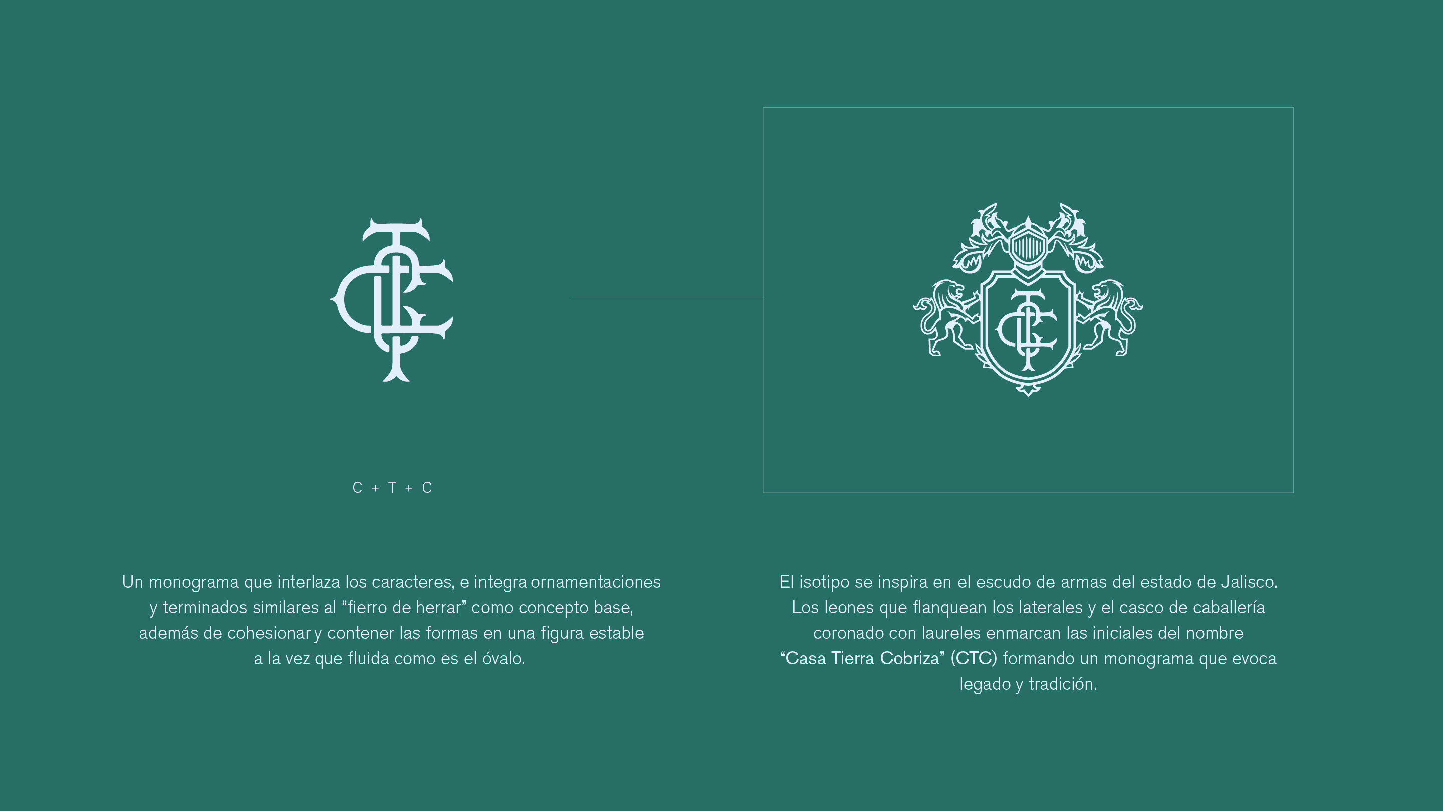
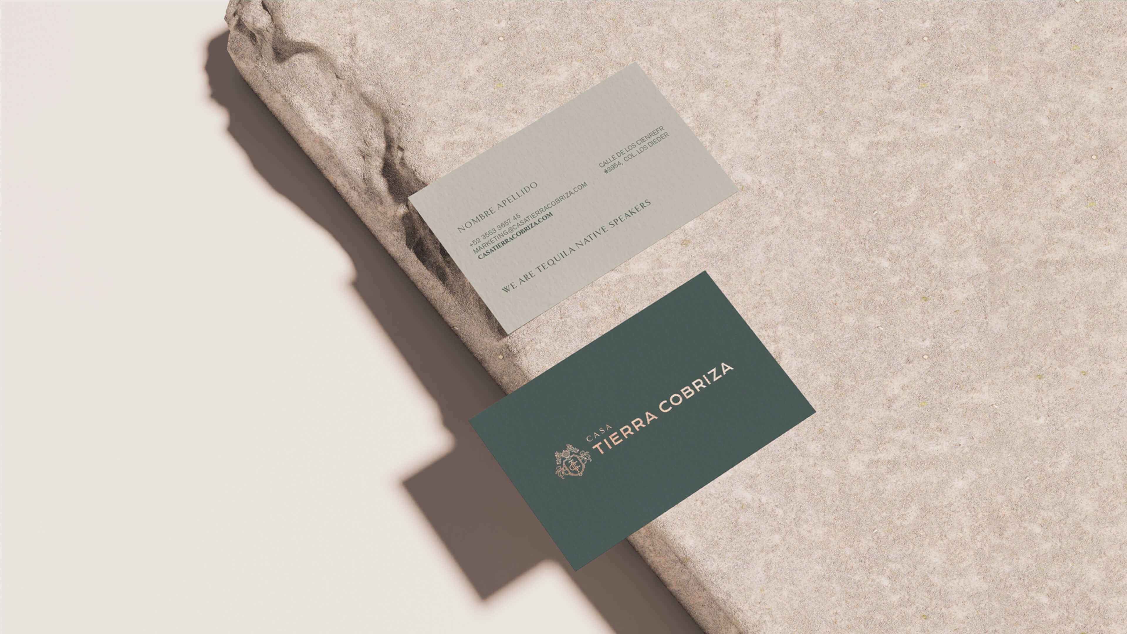
For the visual identity, we drew inspiration from traditional heraldry, including the coat of arms of Jalisco and the visual language of historic Scotch whisky and French cognac houses. We developed an intricate crest incorporating a monogram, ornamental lions, and a helmet. The accompanying wordmark combines classical serif and contemporary sans-serif typography, while an earthy palette of greens and copper tones reinforces the connection between tradition, innovation, and the land.
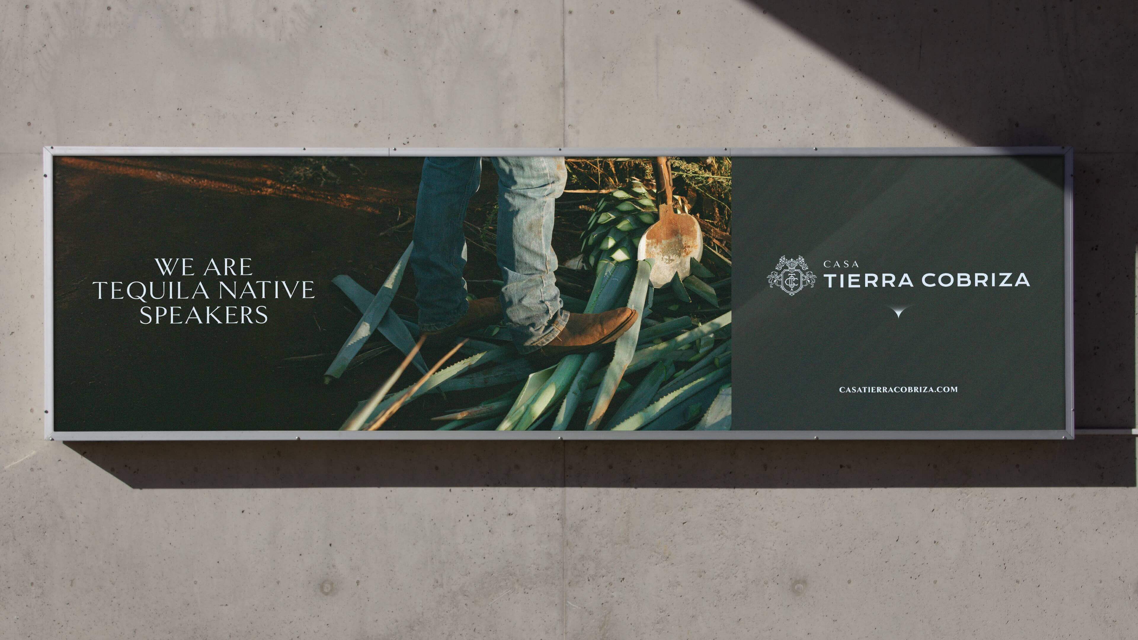
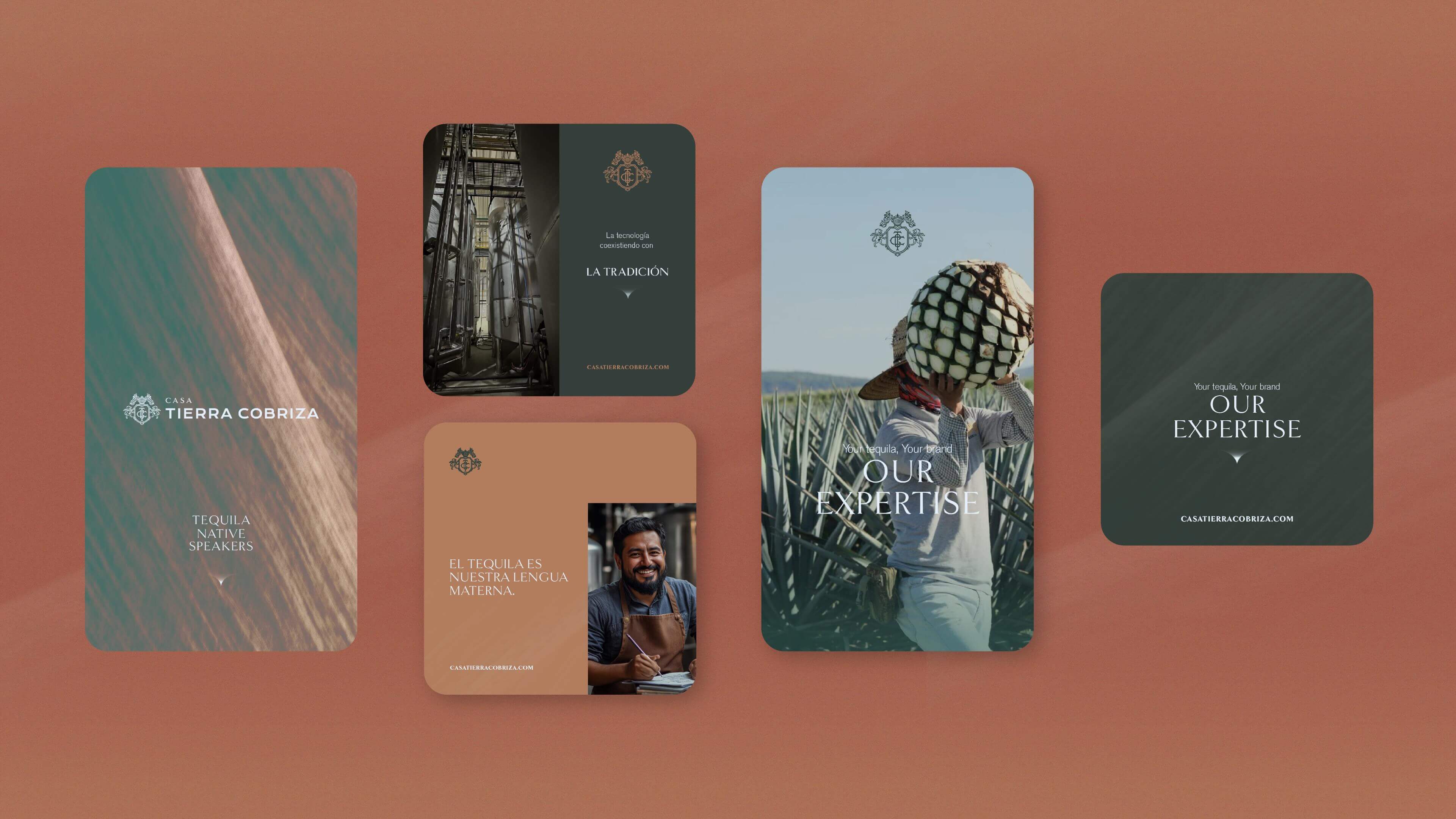
To connect with international audiences, we developed the creative platform “We are tequila native speakers”, a statement that transforms Mexican identity into an expression of expertise. This concept became the foundation of a comprehensive verbal identity, with a confident, knowledgeable voice and communication guidelines built around cultural heritage, innovation, diversity, and shared experiences. Together, these elements establish a narrative in which tequila is a common language, and every brand in the portfolio represents a different way of speaking it.
We extended the identity into art direction guidelines, defining a photographic language that combines industrial precision, human craftsmanship, and the landscapes of Jalisco. A consistent visual treatment and structured advertising layouts establish a cohesive communication system, allowing Casa Tierra Cobriza to project its expertise and Mexican identity across corporate materials and international markets.