Objective
To develop a brand strategy, visual identity, and packaging system that would communicate Re-Feel Beauty's commitment to product quality, professional hygiene, and responsible consumption, creating a distinctive brand capable of connecting with both beauty professionals and everyday consumers.
Solution
Our strategic process identified an opportunity to bring together the credibility and functionality associated with professional hygiene products and the emotional appeal of contemporary beauty brands. We established a brand direction centered on responsible consumption, accessibility, and the idea that effective beauty care can coexist with more conscious habits.
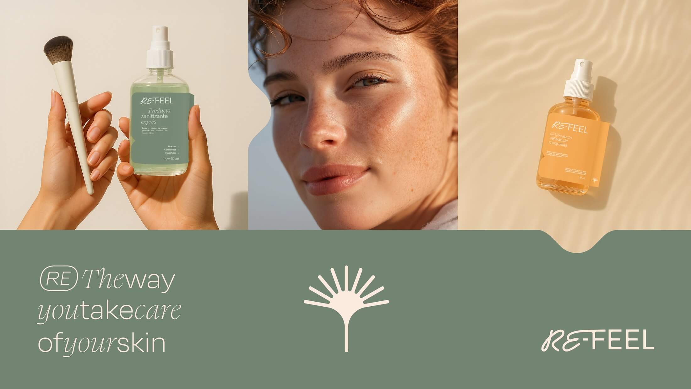
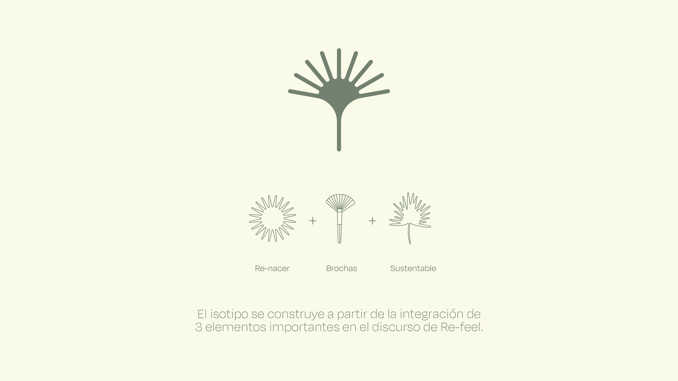
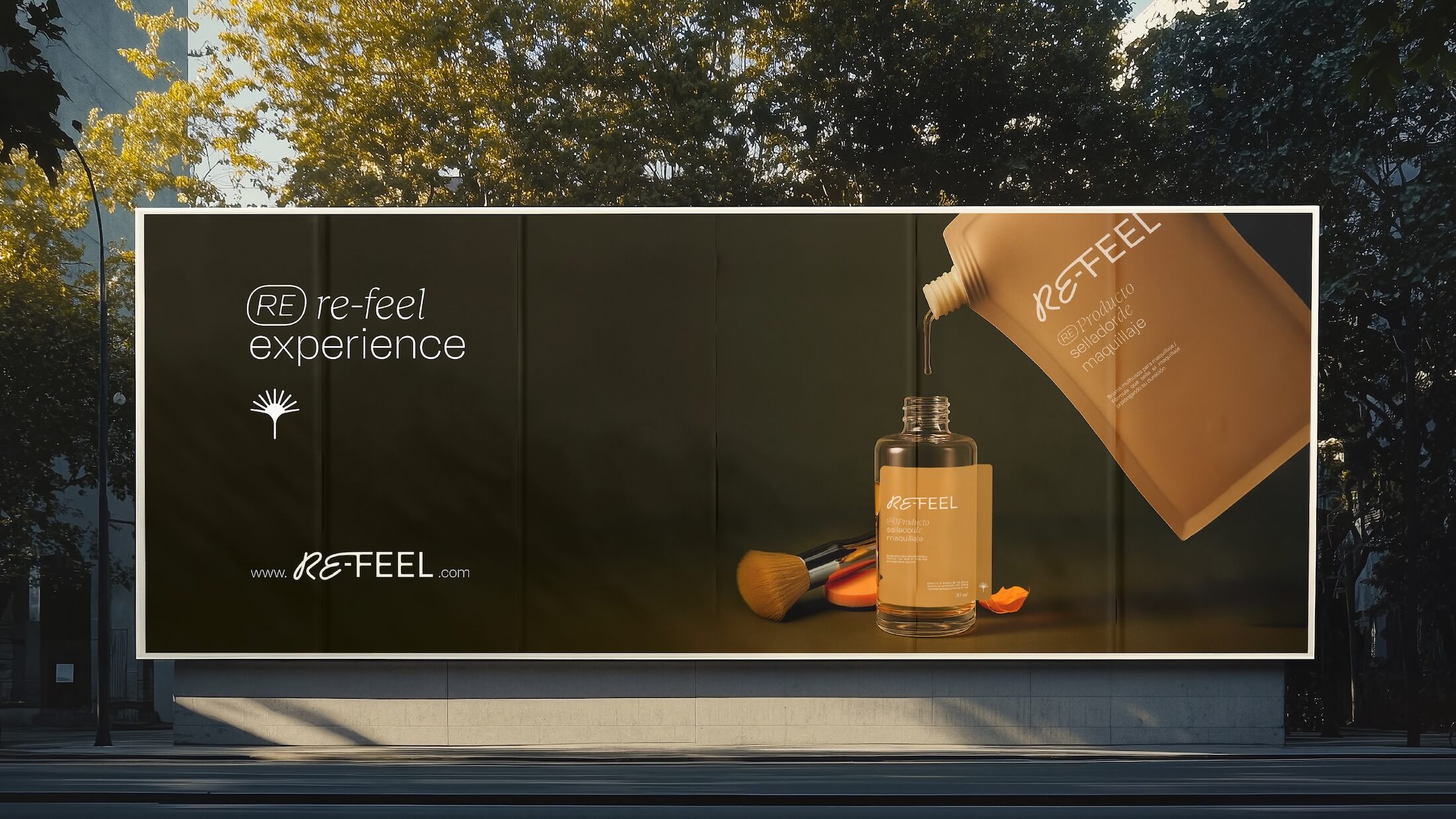
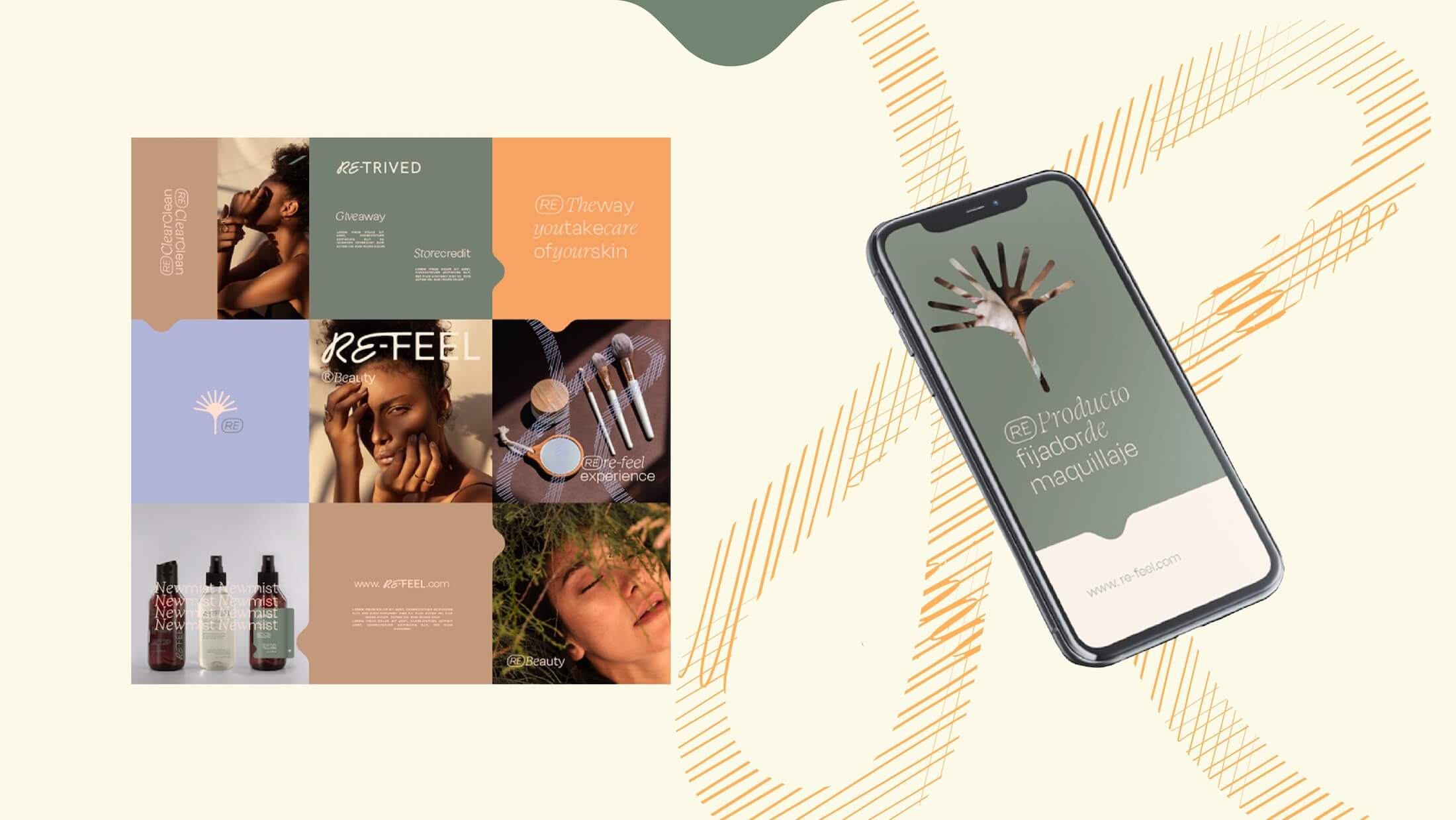
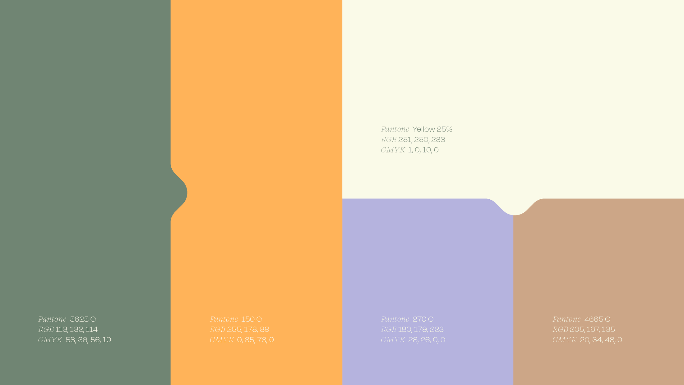
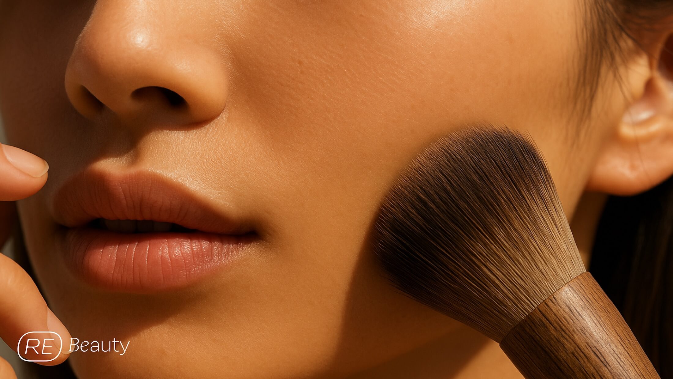
The visual identity combines an expressive logotype with contrasting typography and a palette of muted greens, warm oranges, and soft lilacs. Its distinctive symbol brings together three elements central to the brand's philosophy: a sun, a makeup brush, and a leaf, representing renewal, beauty, and sustainability.
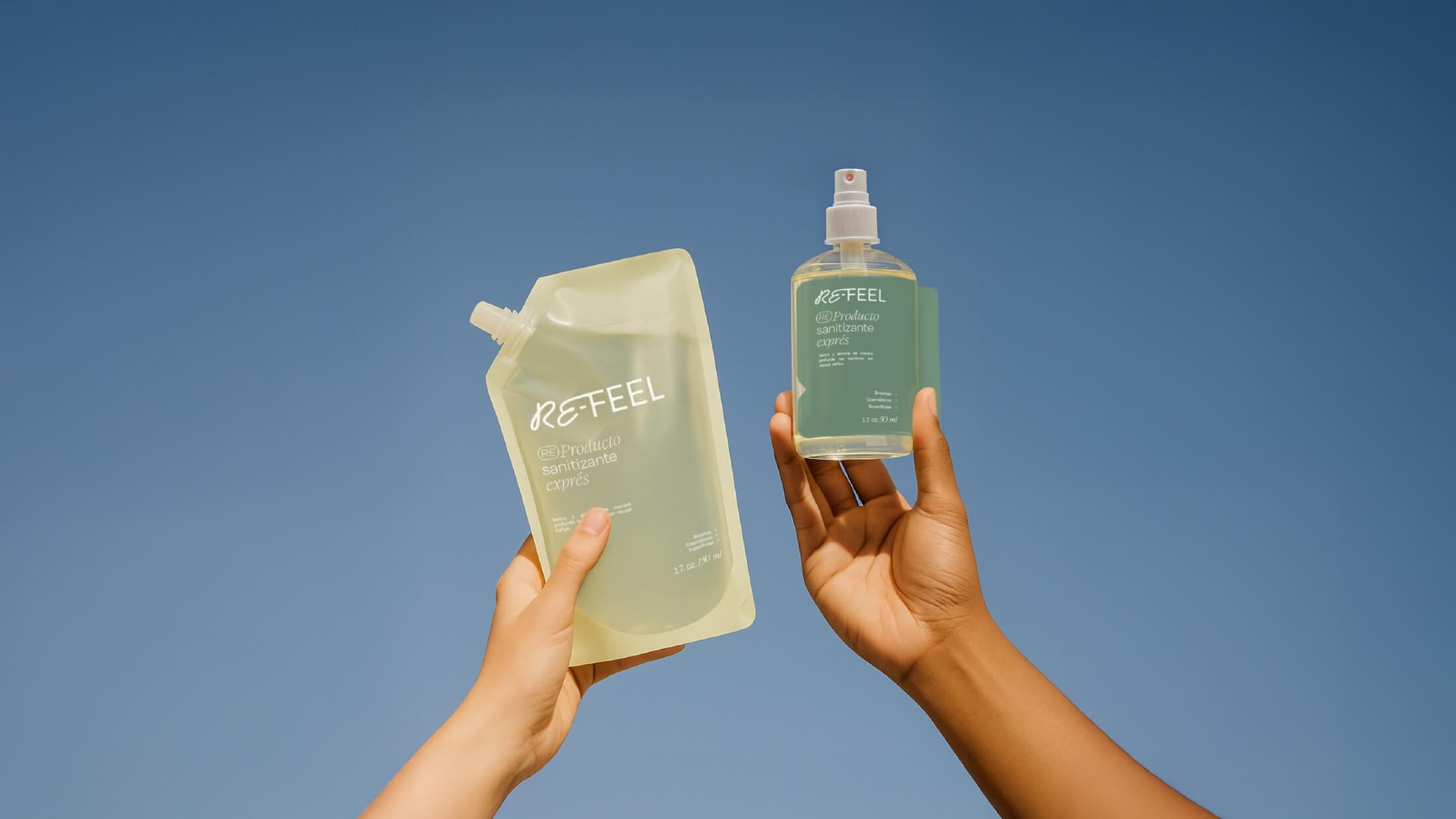
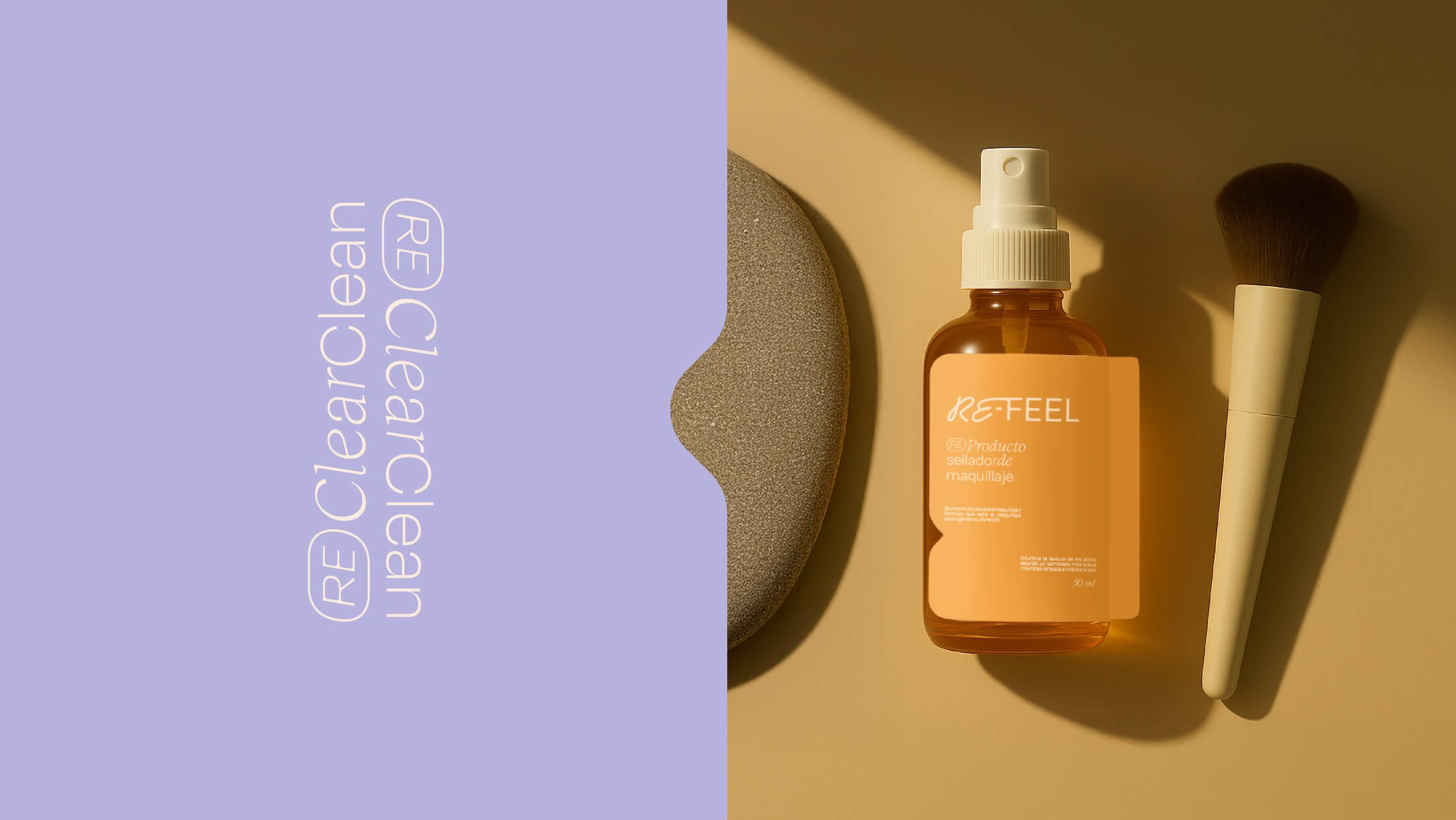
We extended this visual language to the packaging design, creating a cohesive system for the original products and their refill formats. Clear graphic hierarchies, solid colors, and consistent brand elements help make the products recognizable while reinforcing their refillable nature.
Together, the strategy, identity, and packaging establish a contemporary beauty brand that connects product functionality with a more responsible approach to everyday consumption.