Objective
To develop a brand strategy, name, visual identity, packaging, and website for a Mexican artisanal tortilla brand entering the North American market. Beyond differentiating the product from industrial competitors, the central challenge was cultural: creating an identity that would resonate with second- and third-generation Mexican Americans, for whom certain visual traditions evoke pride and belonging, without relying on stereotypes that might feel inauthentic or clichéd to audiences who grew up in Mexico.
Solution
Our strategic research revealed how perceptions of Mexican identity differ across generations and borders. We identified an opportunity to move beyond the familiar visual conventions of Mexican and Tex-Mex products, developing an expression of cultural heritage that could evoke nostalgia and belonging without reducing Mexican culture to a collection of stereotypes.
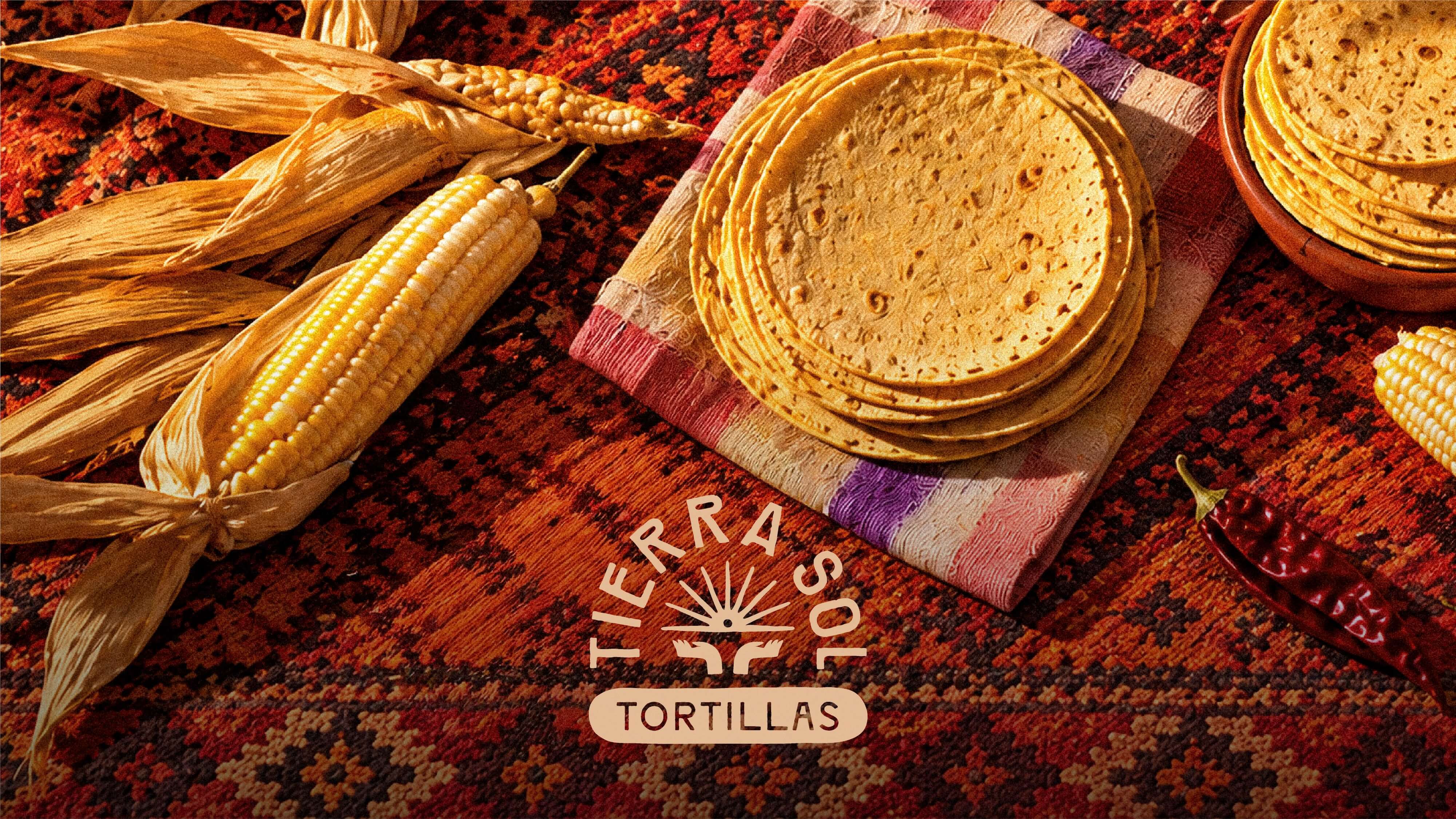
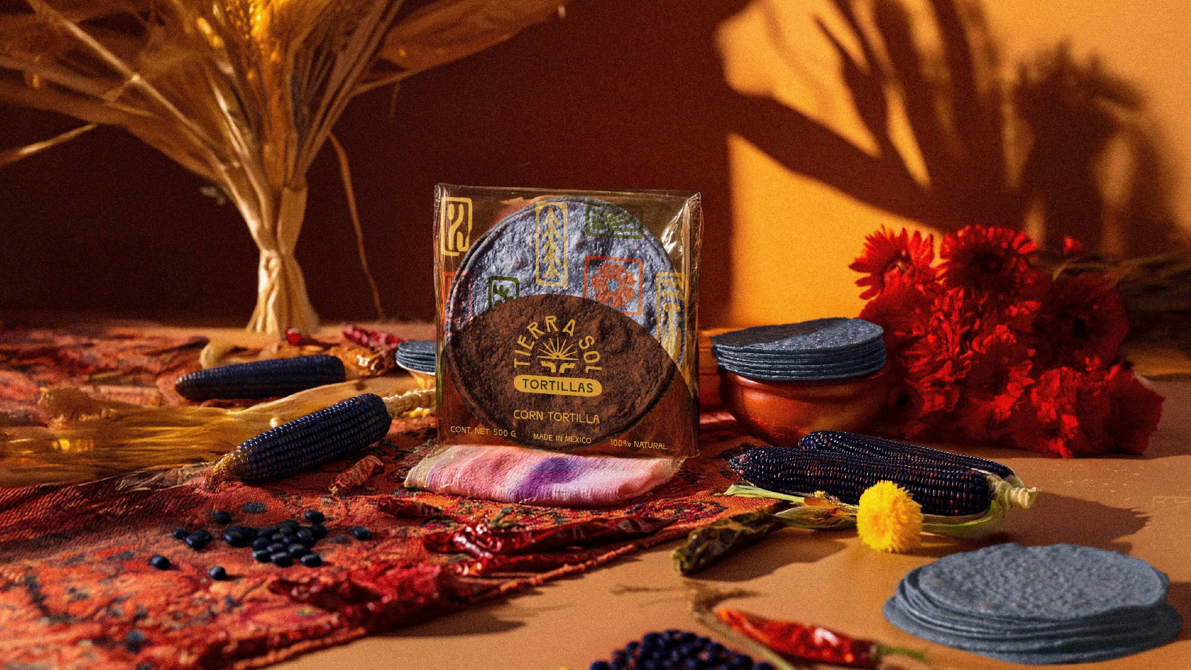
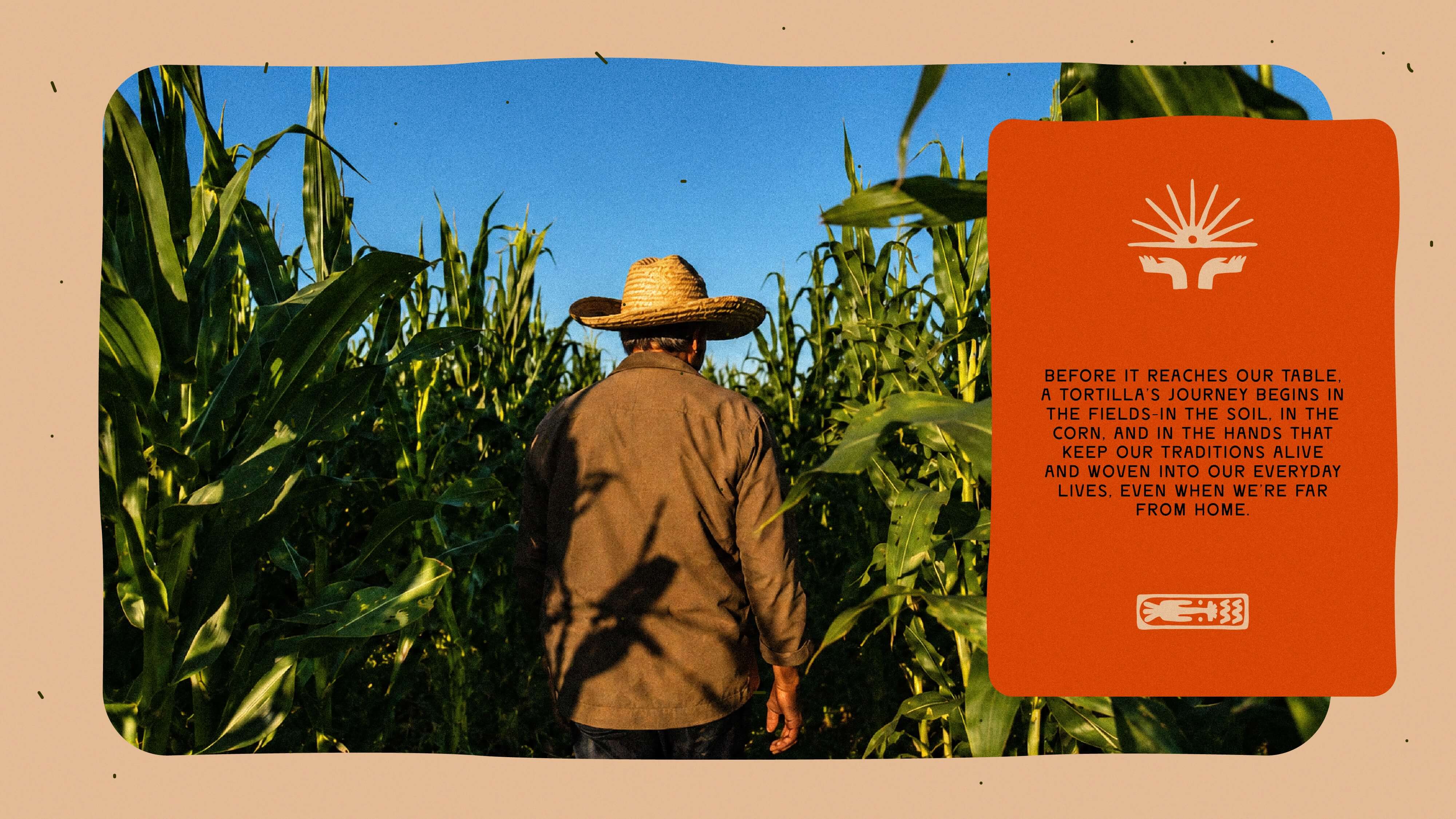
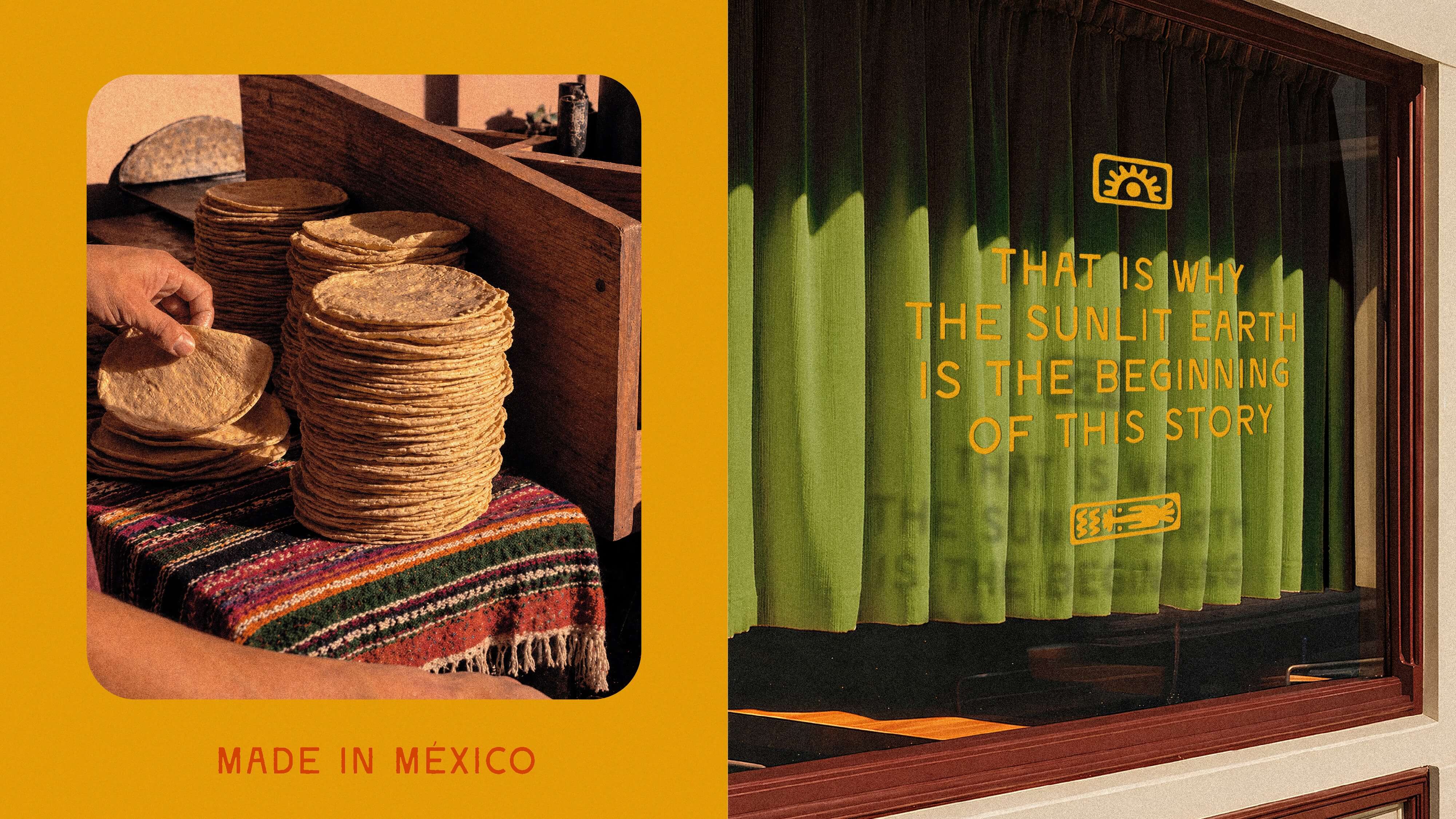
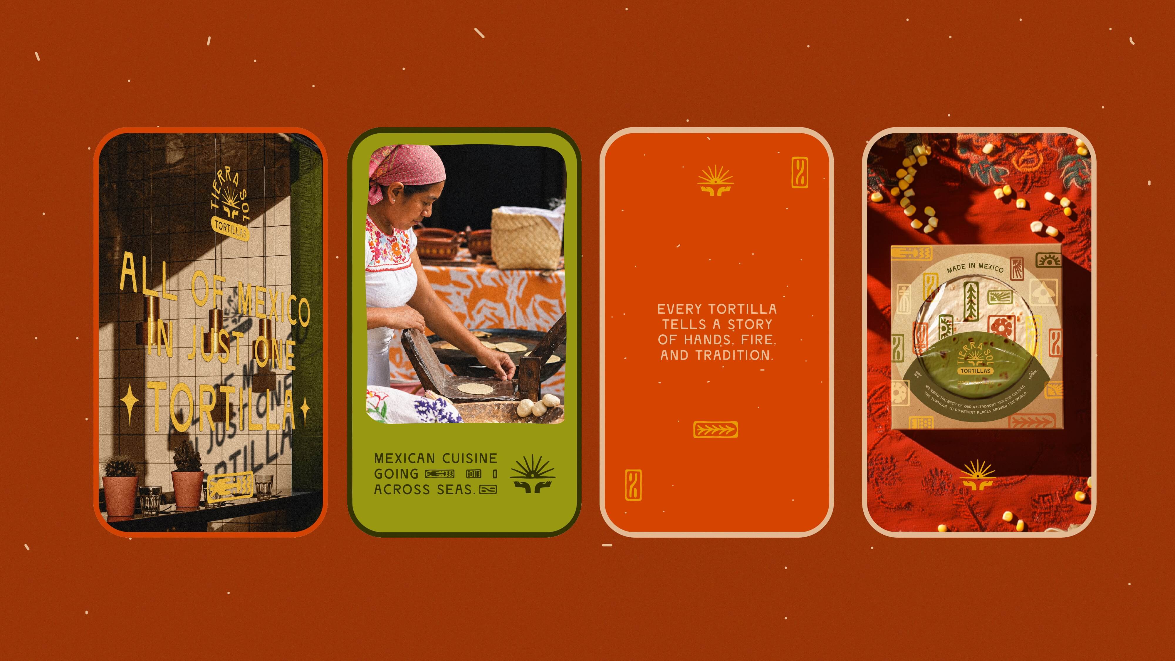
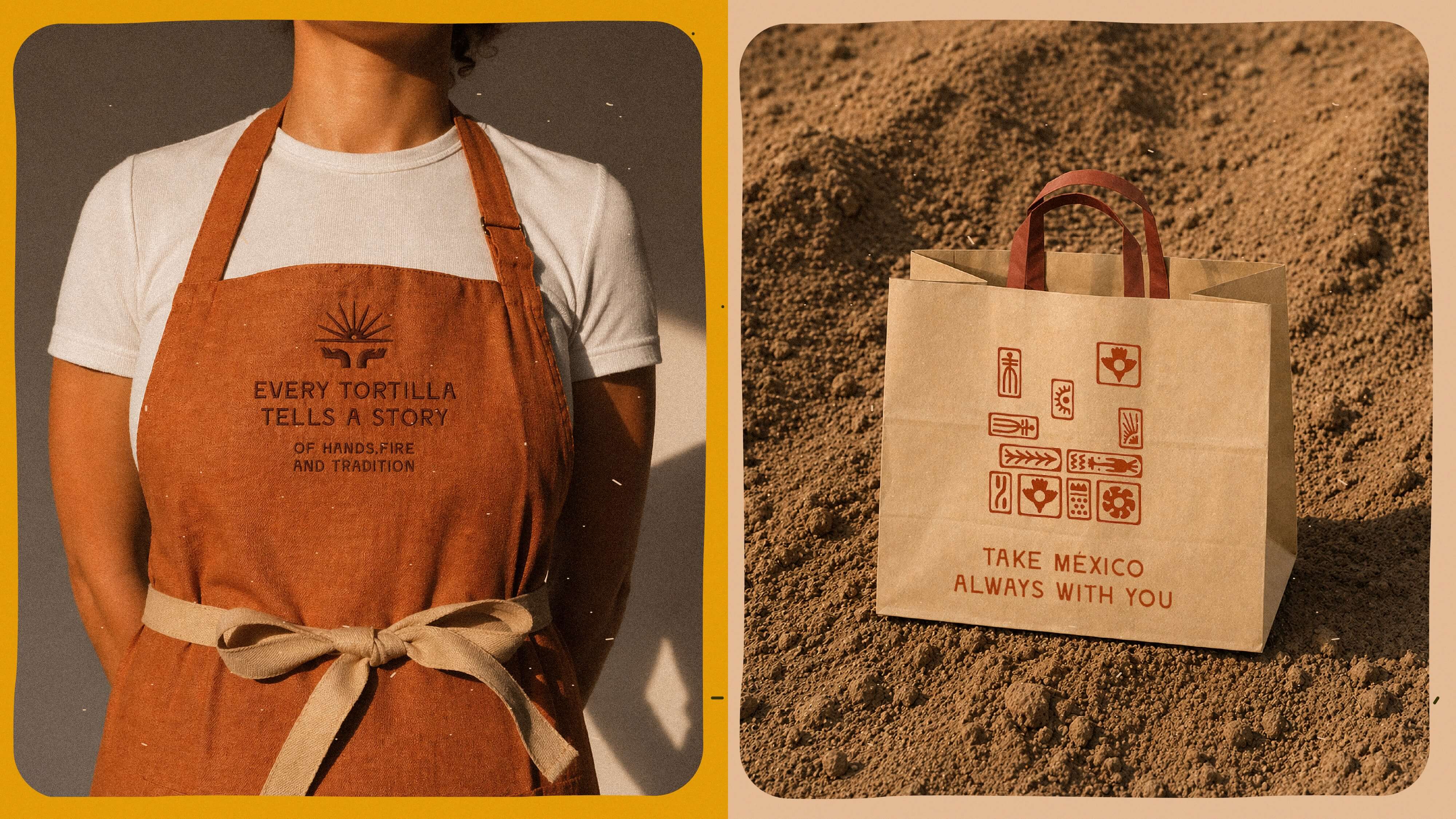
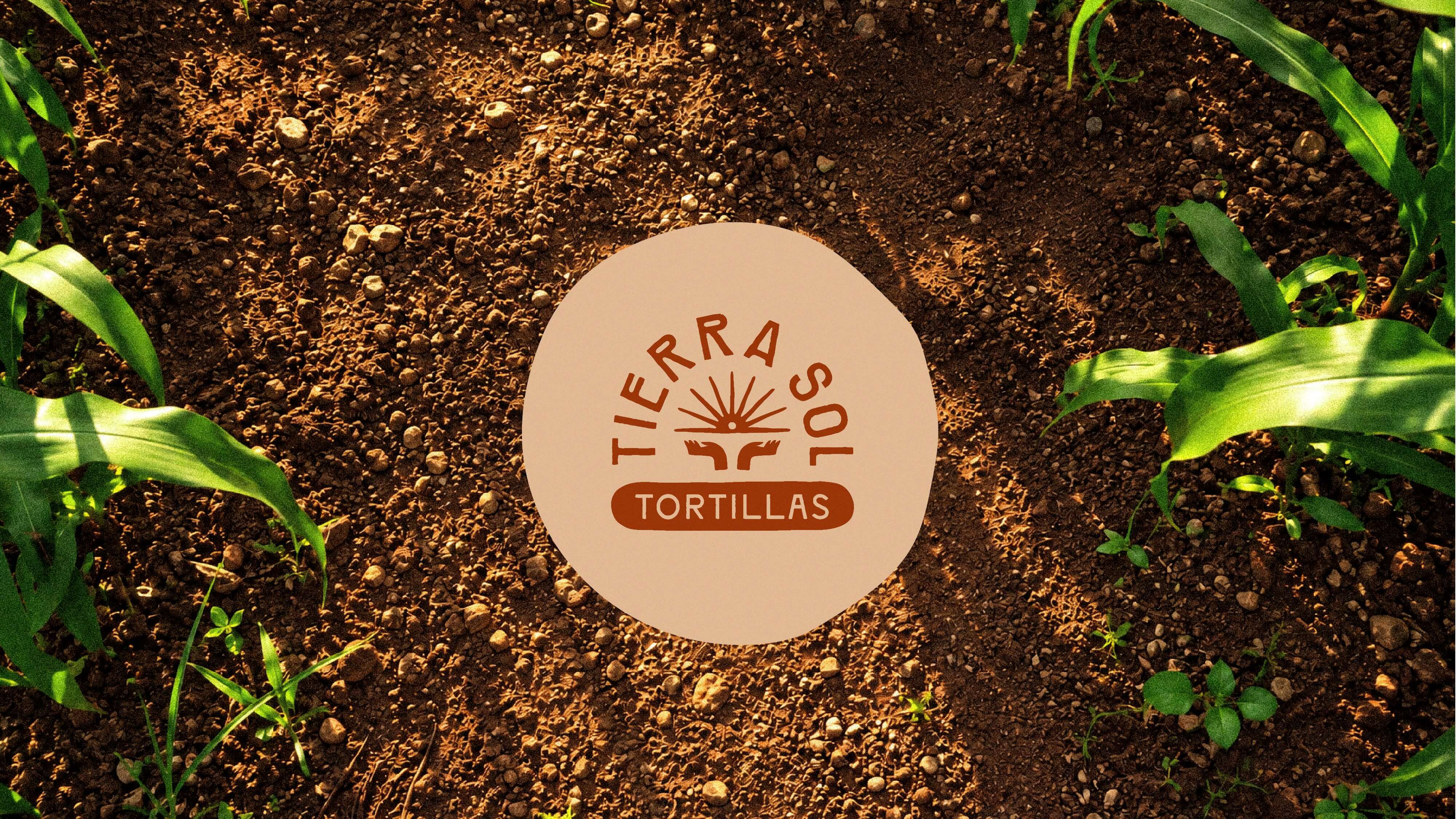
Under the creative territory “Homenaje al Quinto Sol” (Tribute to the Fifth Sun), we built the brand around the ancestral relationship between the earth, the sun, and corn. We developed the name Tierra Sol to reflect these essential elements, establishing a meaningful connection to the origins of Mexican cuisine. The visual identity combines expressive typography with an emblem depicting hands holding a rising sun, complemented by graphic symbols inspired by ancient Mexican codices, handcrafted textures, and an earthy, vibrant color palette.
We extended this visual language to vacuum-sealed packaging, branded applications, and a website built on Wix. The resulting identity balances cultural authenticity with contemporary design, creating a recognizable presence for Tierra Sol in international markets while honoring the traditions and people behind its products.