Let’s Talk

Cantú Seguros is an insurance agency with major presence in Monterrey, Guadalajara and Mexico City.
It offers coverage to a wide variety of products, both in a personal and business level.
Given the project's turn, it was important for the visual communication to look friendly and reliable.
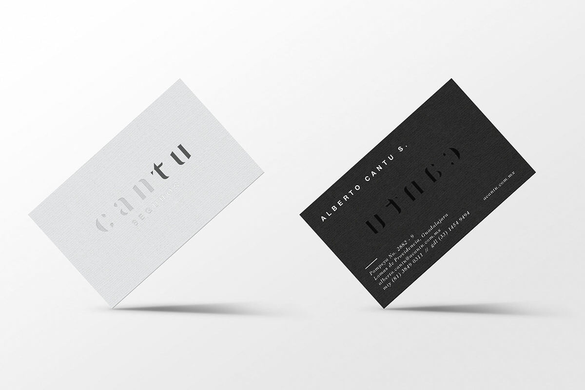
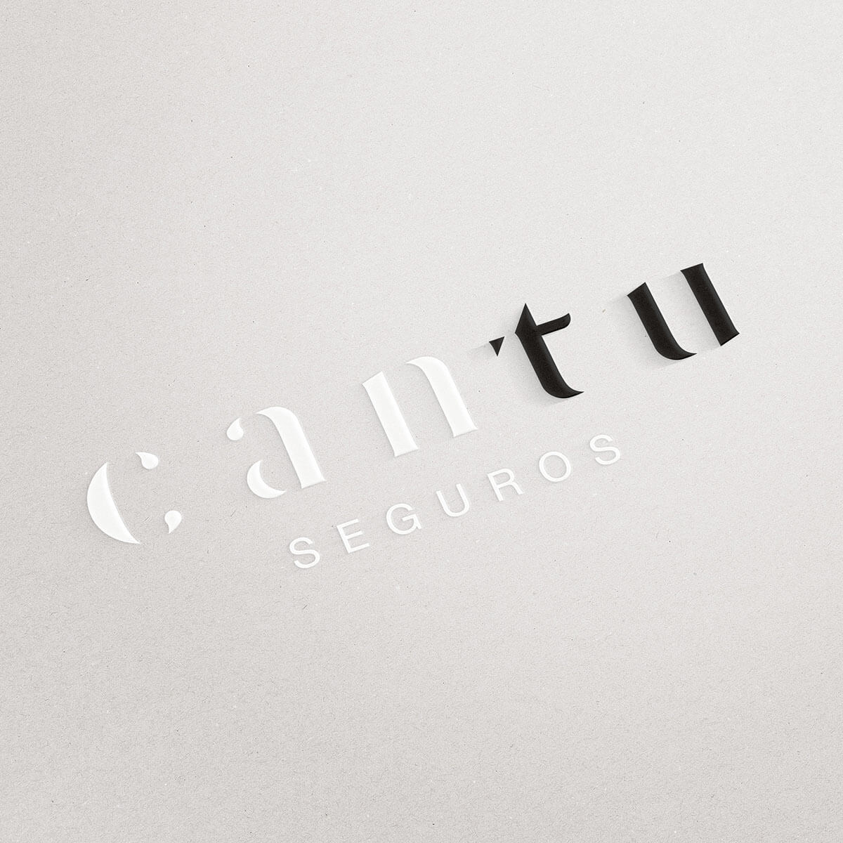
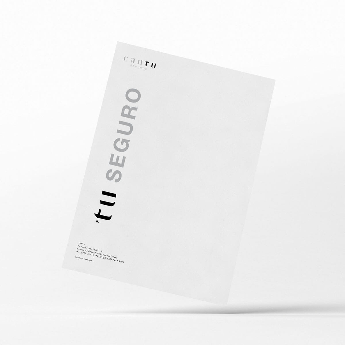
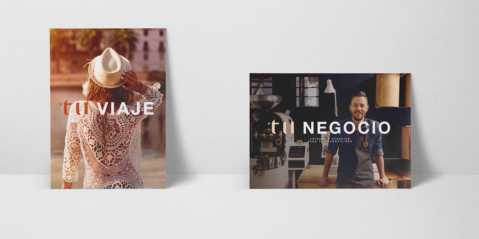
For this project we applied the famous "less is more". The logo is a mixture of fonts: a Serif one that meets the requirement of reliability, and the second one Sans-serif that makes it more friendly. We proposed a game of words with the logo for the advertising campaing.


