Let’s Talk

Centro Hospitalario Oblatos is an Ambulatory Surgery Center created after detecting the scarcity of medical attention in one of the less privileged areas of Guadalajara.
Impeccable facilities and a team of highly trained professionals make CHO an excellent choice.
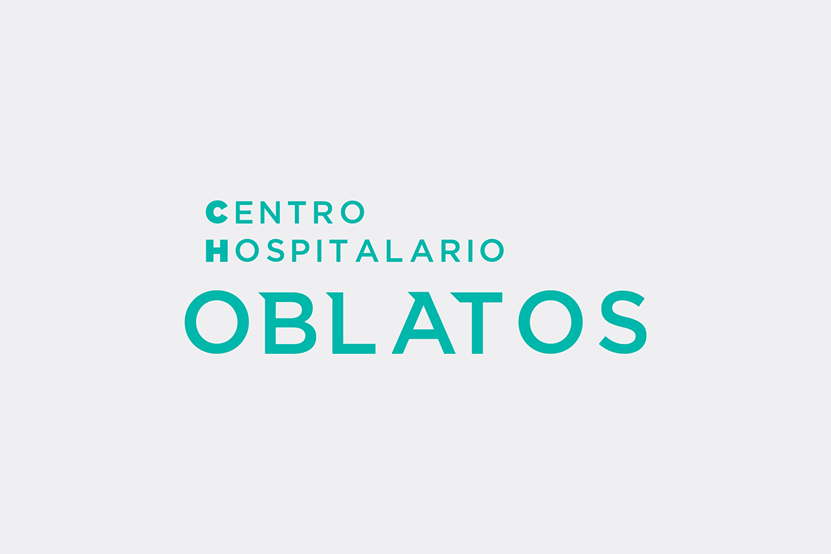
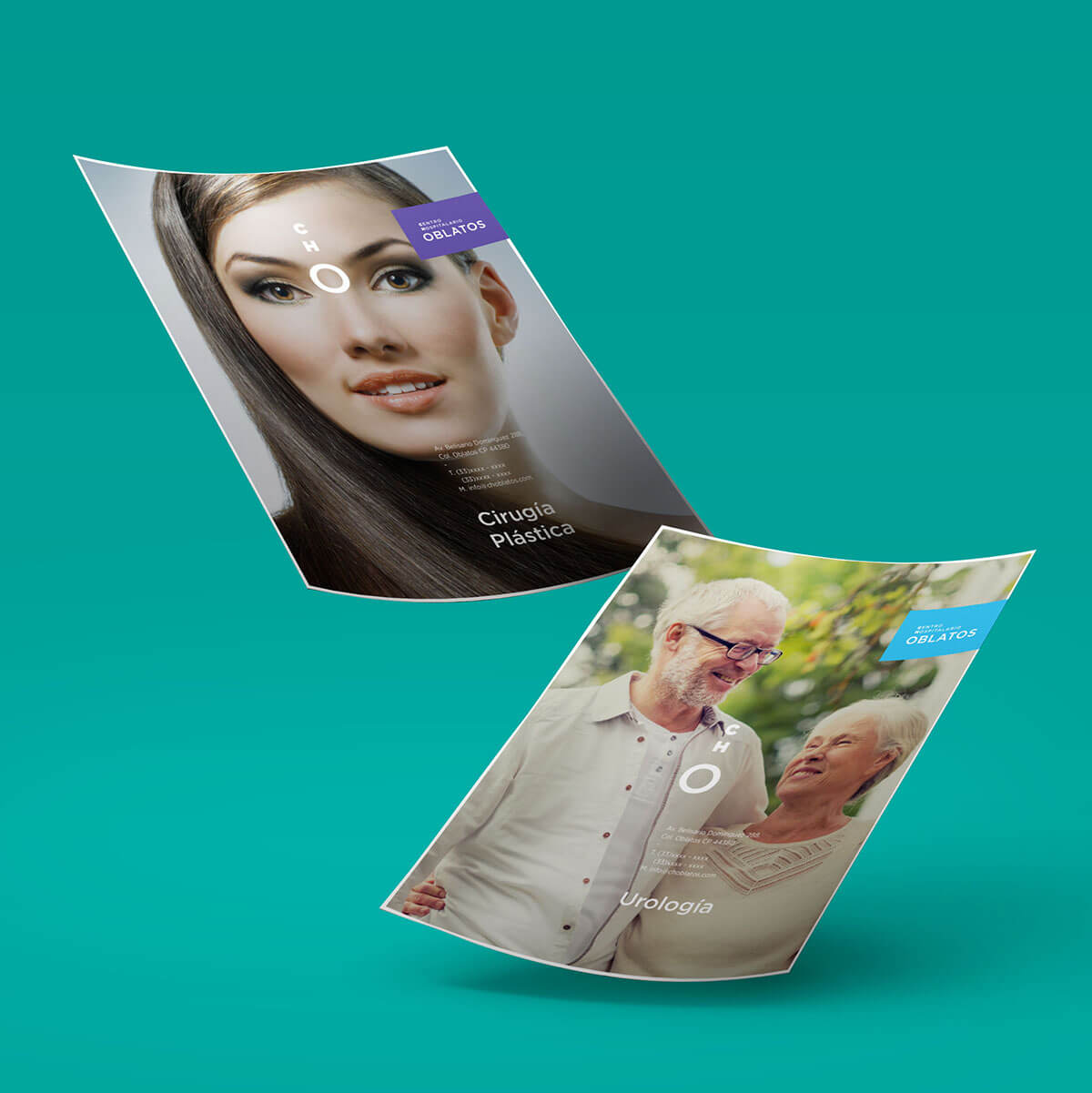
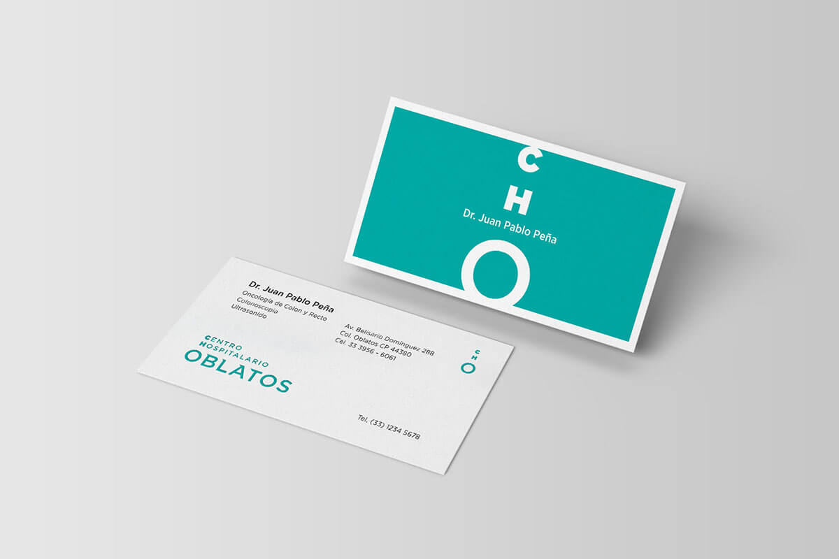
There is an amazing team of specialists behind CHO. Our goal was to communicated just that through a professional but not pretentious graphic concept.
Being a project targeted at underprivileged people, it was very important for the identity to look friendly. To achieve this, we proposed a wide palette of warm colors in which the predominant color is turquoise due to its tranquilizing properties. Regarding the logo, we selected a Sans-serif typeface with best readability. The isotope was designed in such a way that it acquires the shape of a stethoscope.