Let’s Talk
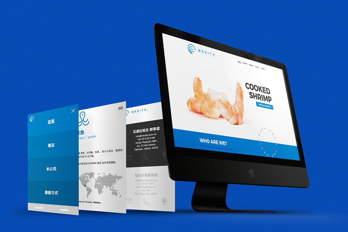
Based in Guadalajara, Menita Comercial is a successful company of Mexican pride dedicated to fishing and importing, marketing and distributing a wide variety of high quality seafood.
Menita's mission dictates to offer only the freshest products to their customers. Their quality reputation precedes the brand.
The client wanted an image renewal; he was looking for a proposal that differed his product from the competition’s but stuck within the parameters of the seafood industry.
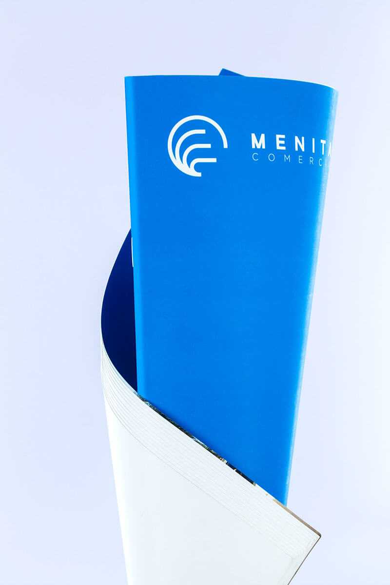
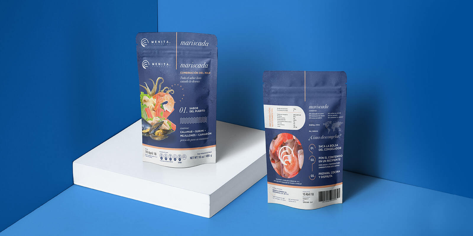
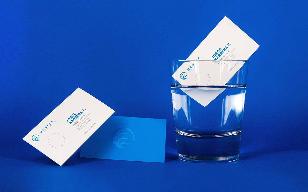
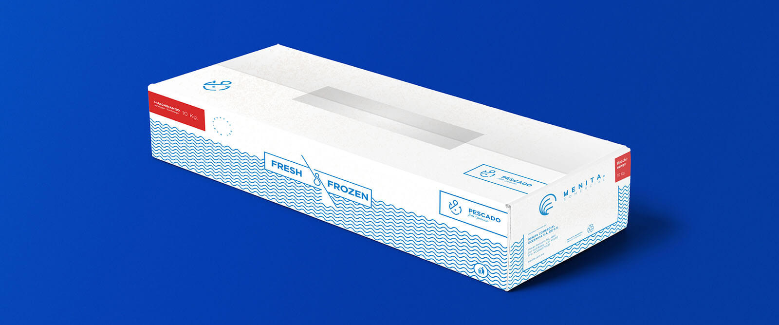
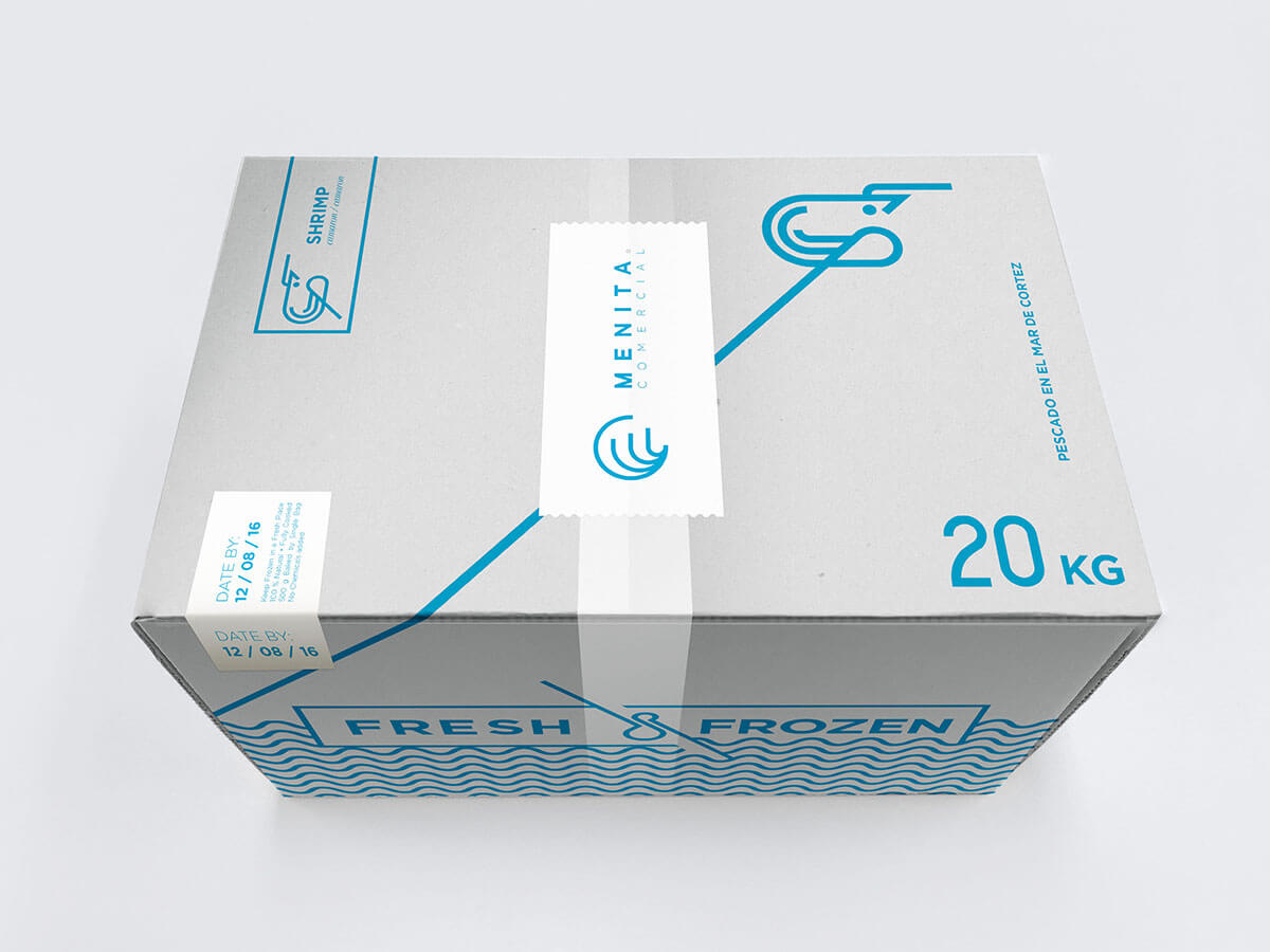
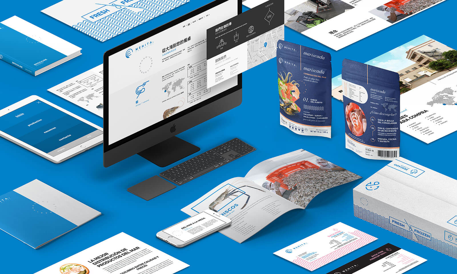
We knew what we did not want for this project: photographs of fish. We rather opted for a much more minimalist and friendly identity; we chose a clean, Sans-serif font for the logo. As for the isotype, the three lines refer to the three shrimp found in the original identity. Within the same aesthetic line, a set of illustrations of sea elements was proposed.
