Let’s Talk
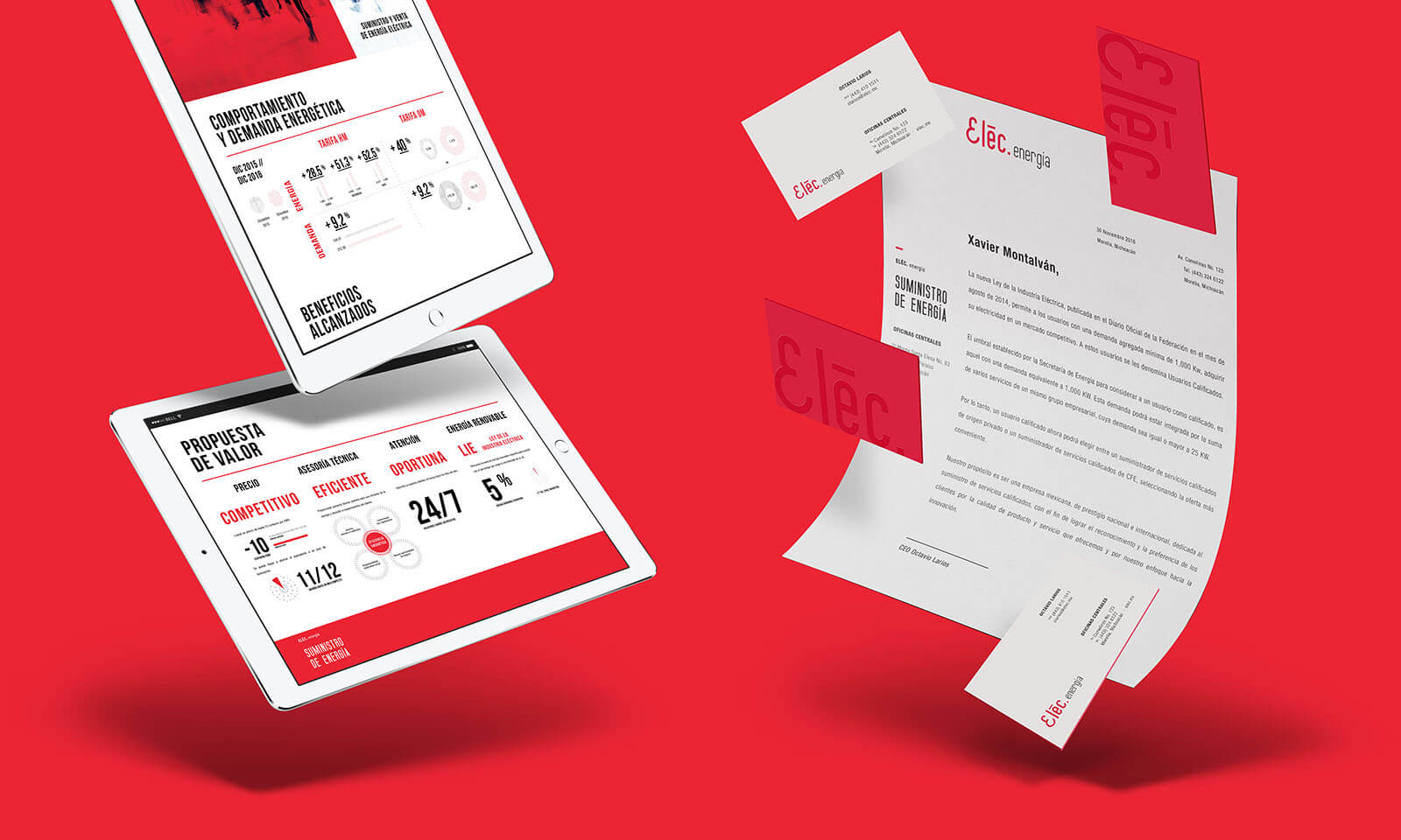
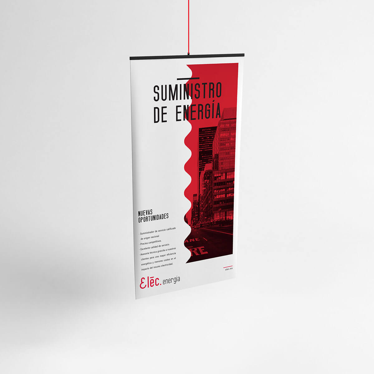
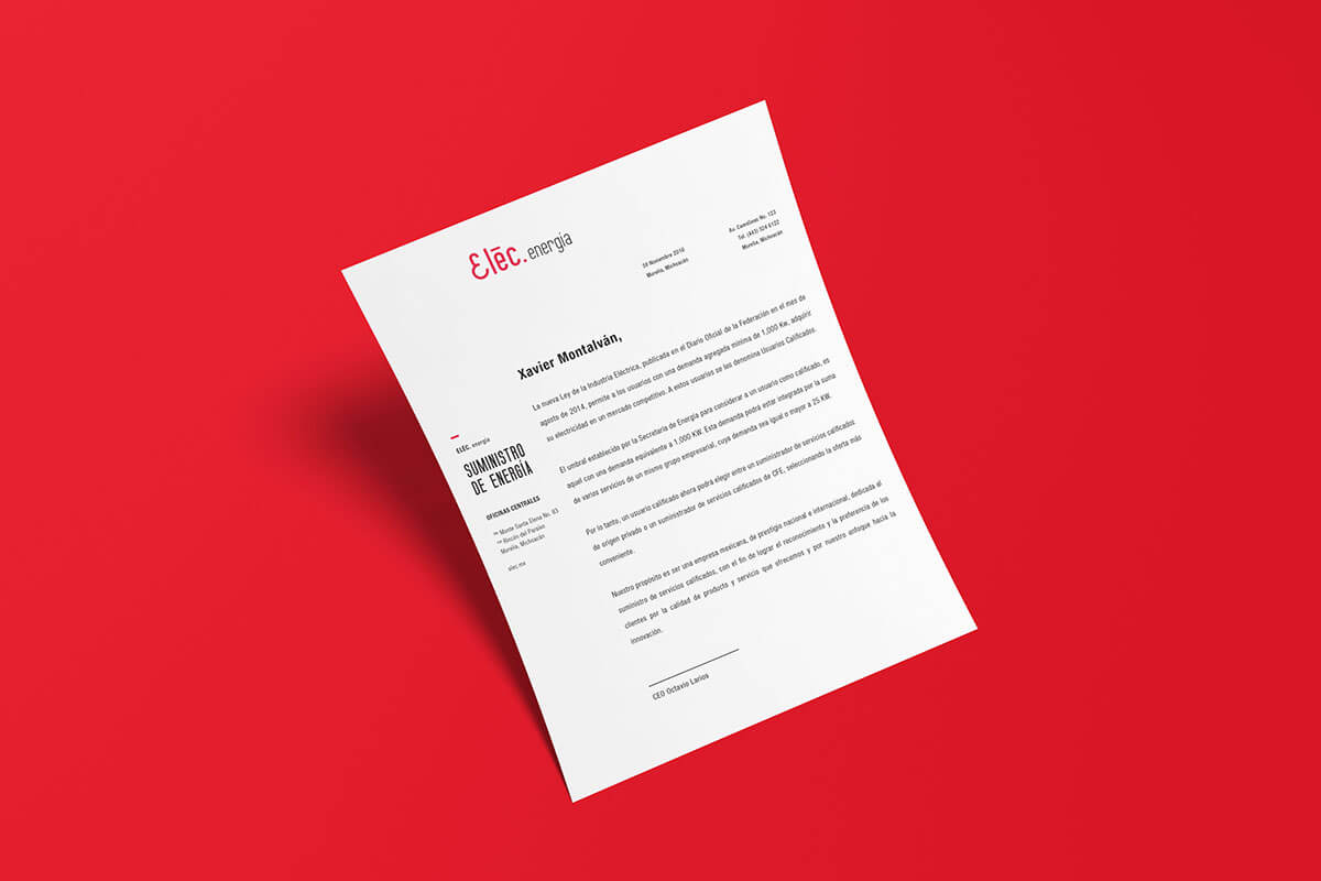
Eléc Energía is an electricity supply company specialized in electric power efficiency in different business areas.
Also, it offers personalized attention and advisory to a very specific market segment known as "qualified users".
To create a graphic concept to communicate the brand personality: safe, reliable, agile and efficient.
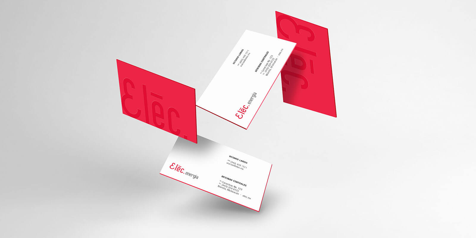
To project the brand attributes correctly, we decided to use a Sans-serif Condensed font on the logo. Also, we added a focus abstraction to the first “E" so the company’s turn would be even more obvious. We chose red in reference to fire, source of natural light.
