Let’s Talk

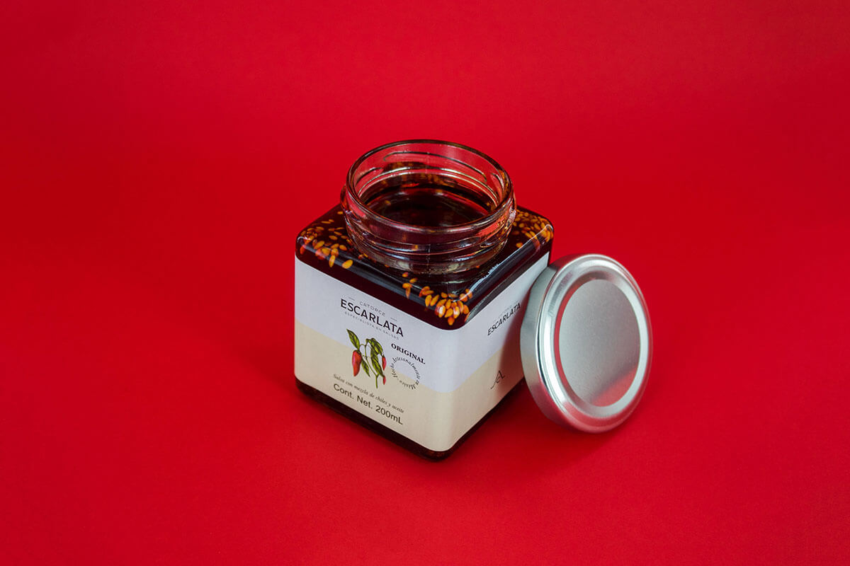
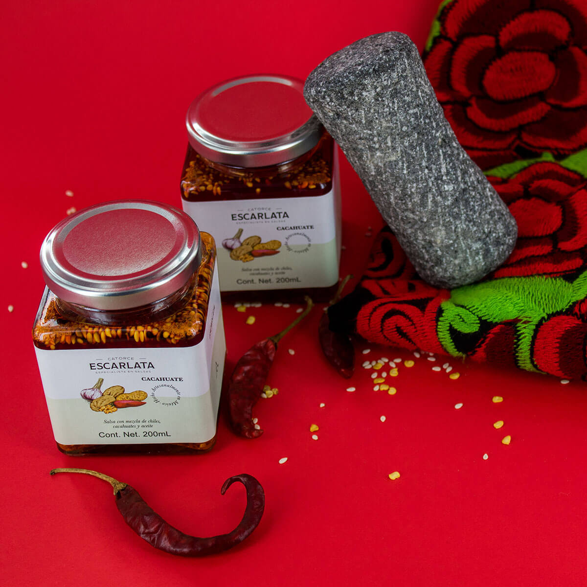
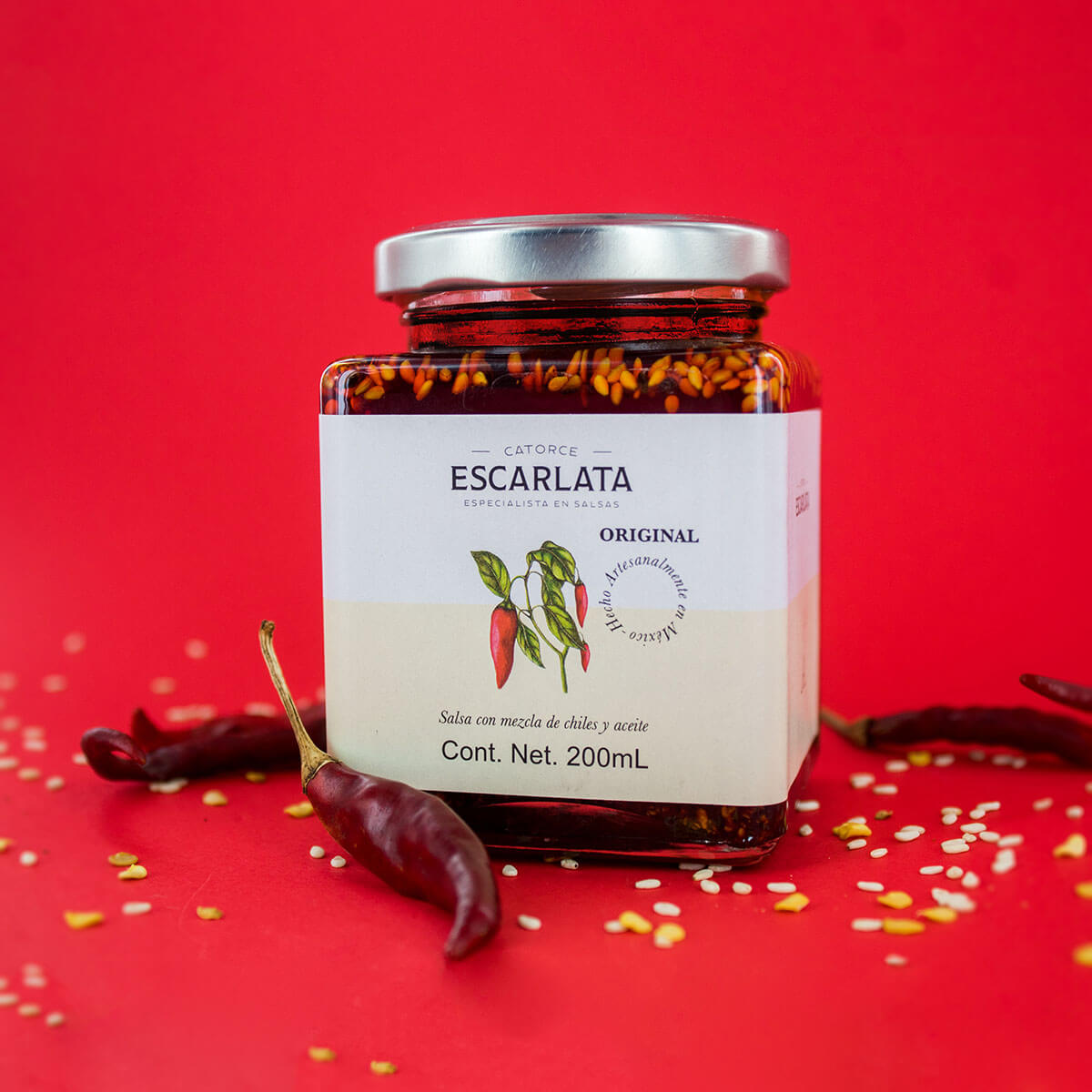
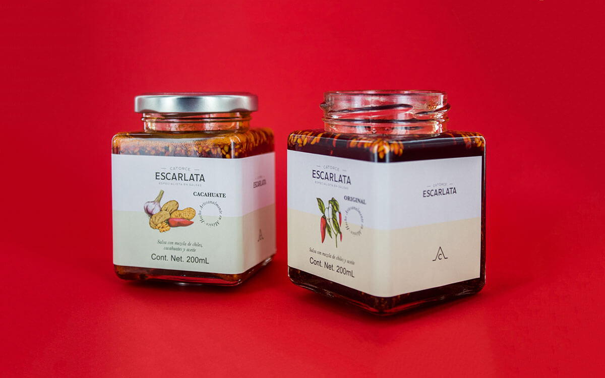
Escarlata is an spicy chili and oil sauce, made in Mexico in an artisanal manner.
Given its natural origin, it is preservative and Trans Fat-free.
To create an identity that displays the natural and artisanal attributes of the sauce in such a way that a future brand expansion is possible.
The name "Escarlata" refers to the red color of the sauce, and provides a strong brand personality. For the logo, a vertical arrangement and weight variations between the characters was suggested. Given the brand expansion plans, a highly adaptable label layout was proposed. As a quick product differentiation strategy, we opted for neutral colors, contrary to what is commonly used by commercial brands. Illustrations of the ingredients evoke tradition.