Objective
To develop a distinctive name and visual identity that would reflect the bakery's Danish origins while remaining approachable and recognizable to Puerto Vallarta's international visitors and bilingual local community. The identity also needed to extend consistently across packaging, menus, and in-store signage.
Solution
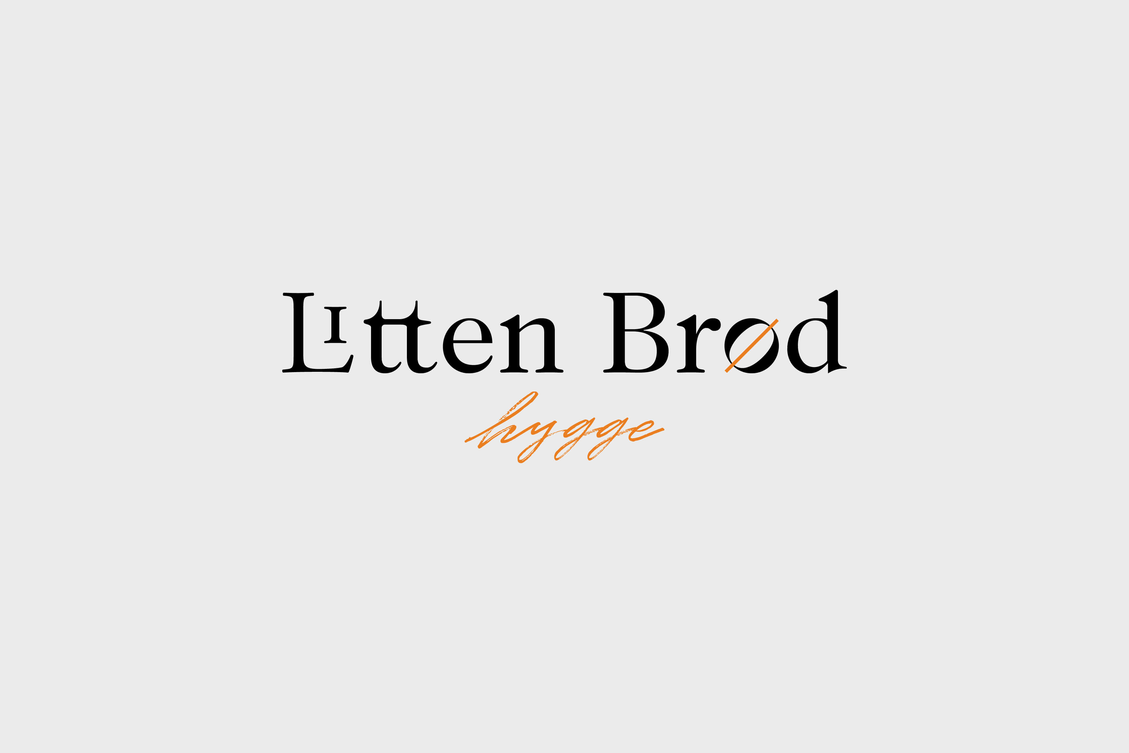
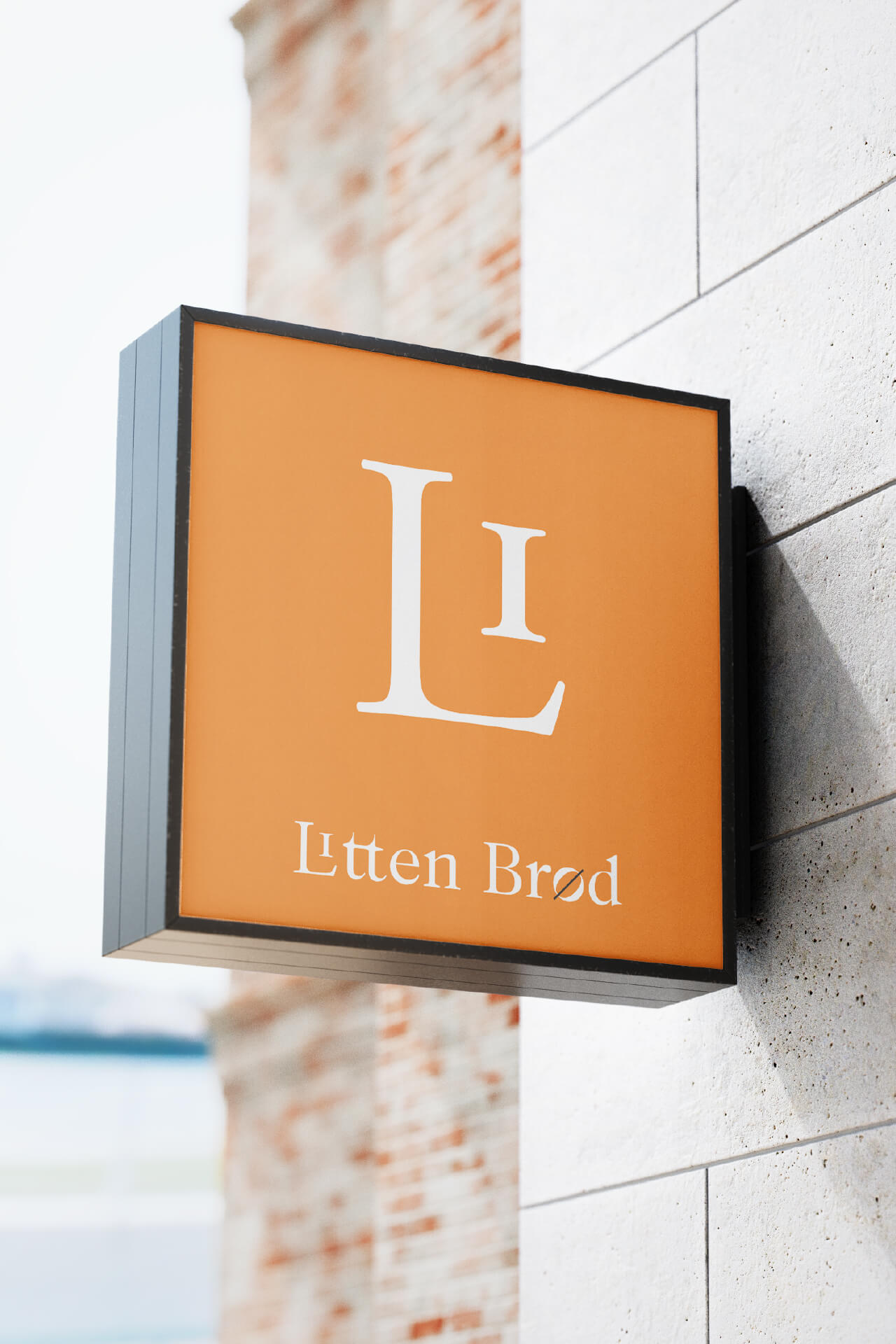
We created the name Litten Brød to establish an immediate connection with the bakery's Danish heritage. Its phonetic resemblance to “little bread” in English made it intuitive and memorable for an audience familiar with both languages, preserving its cultural character without compromising accessibility.
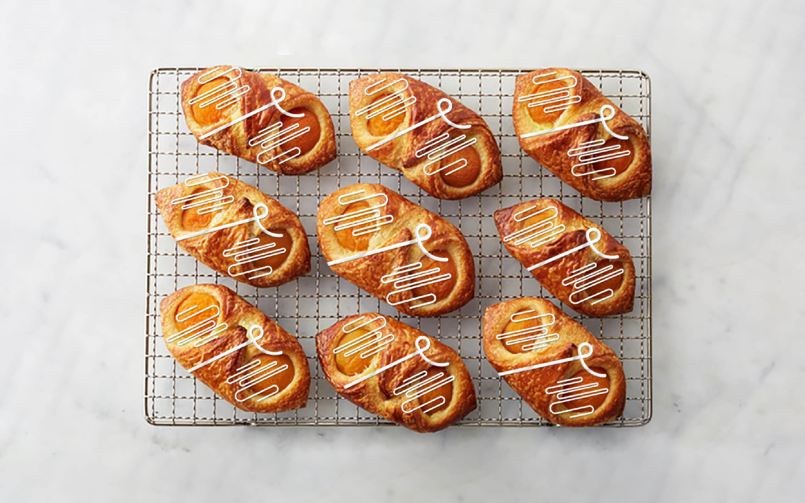
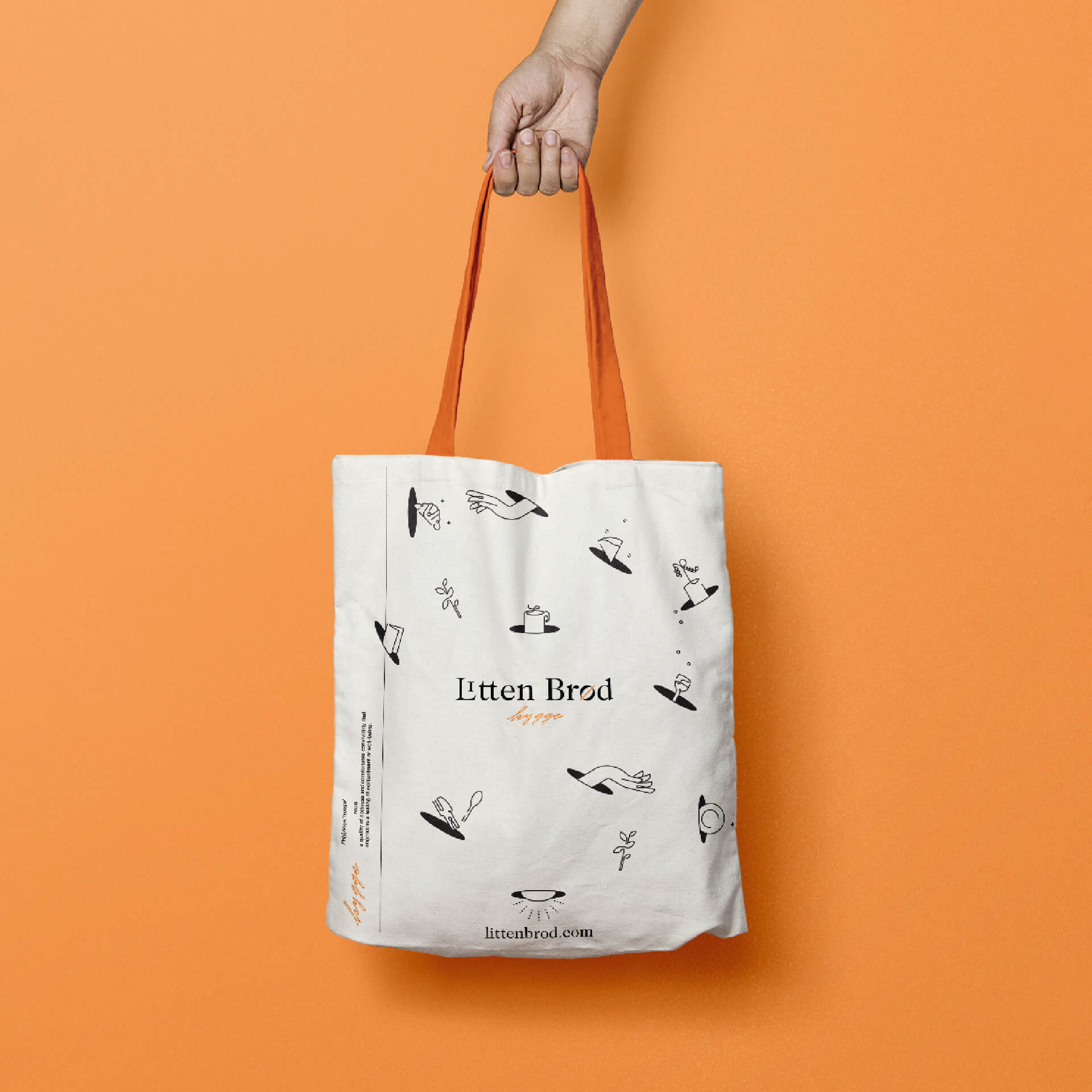
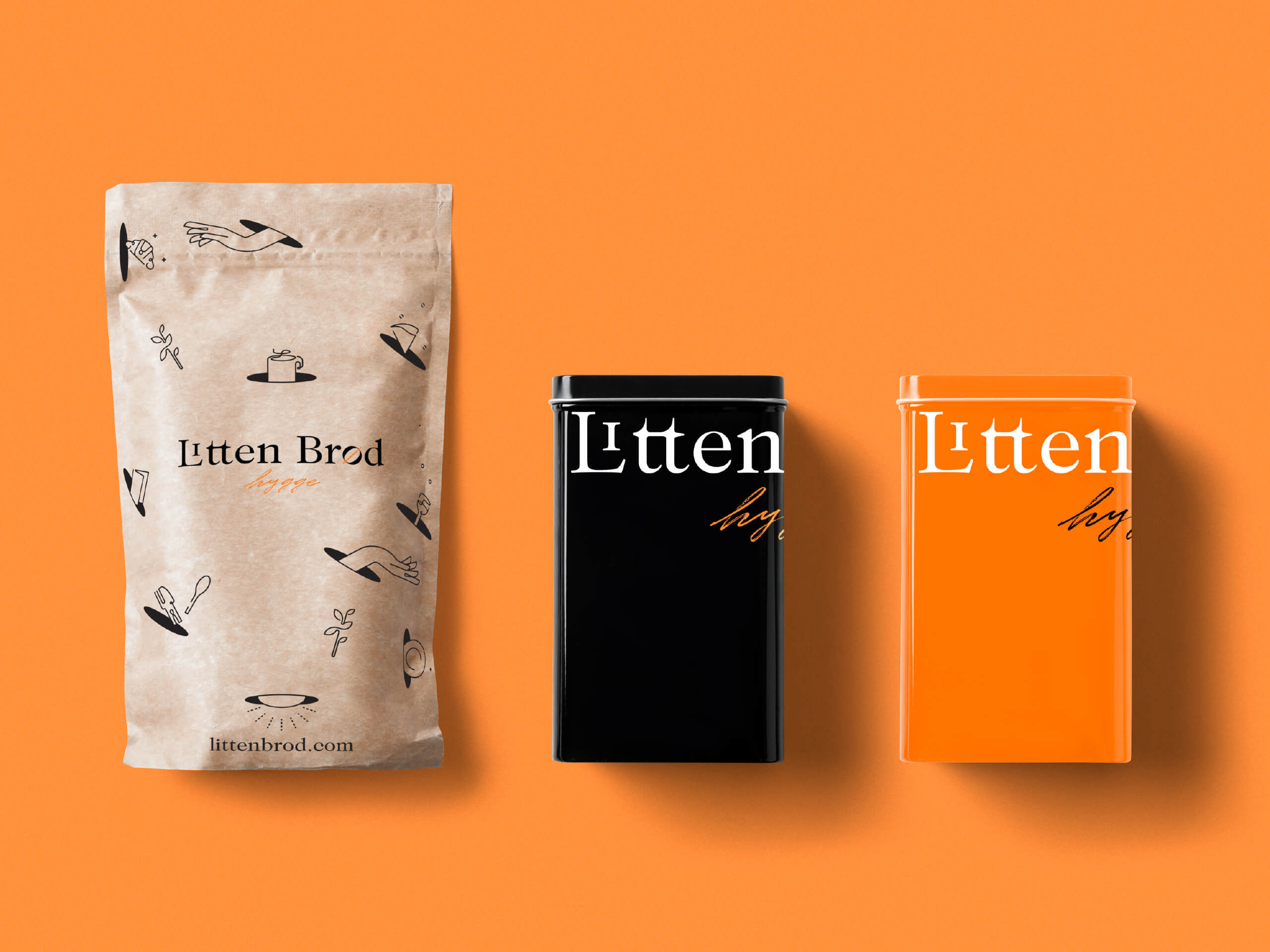
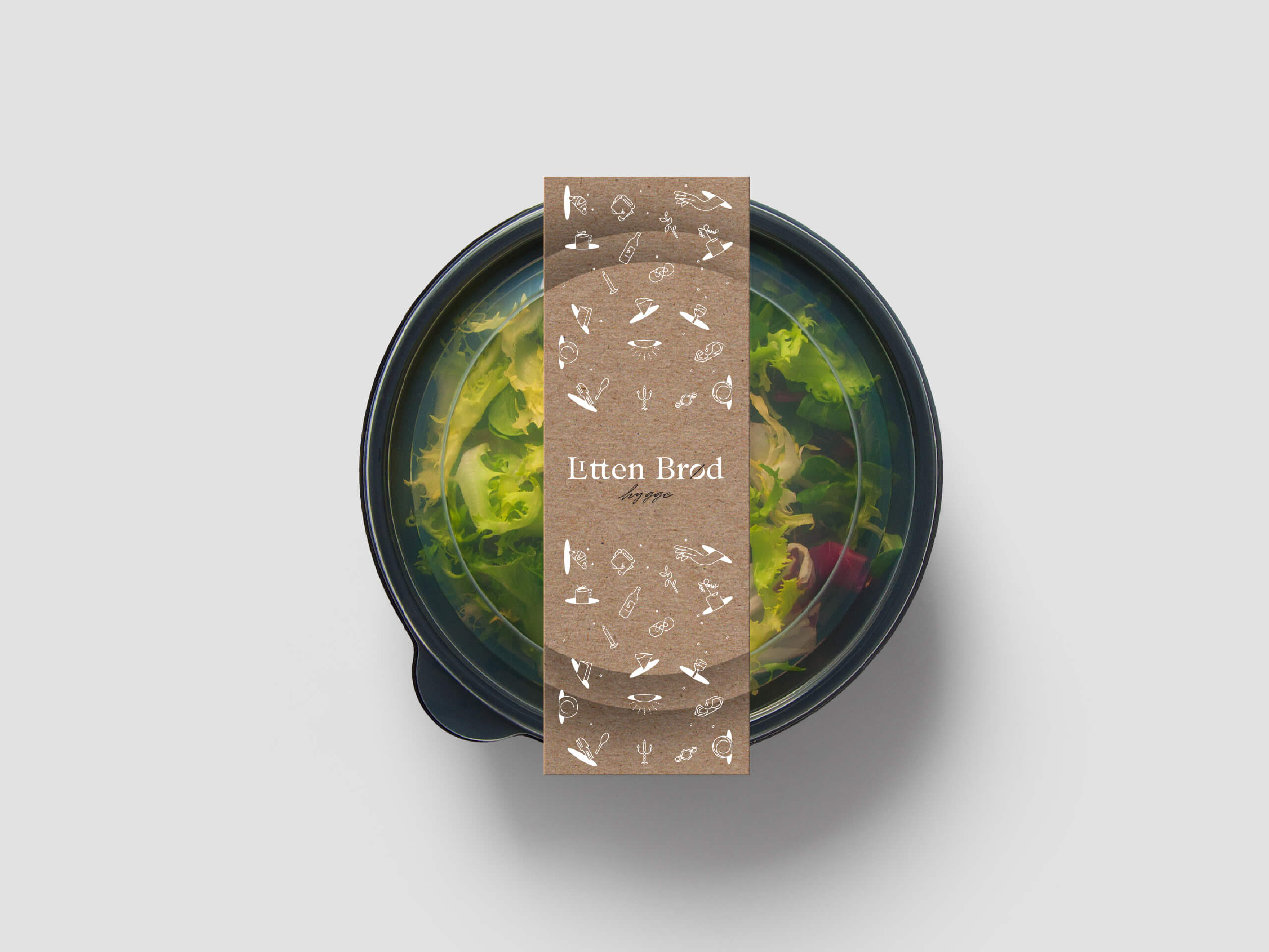
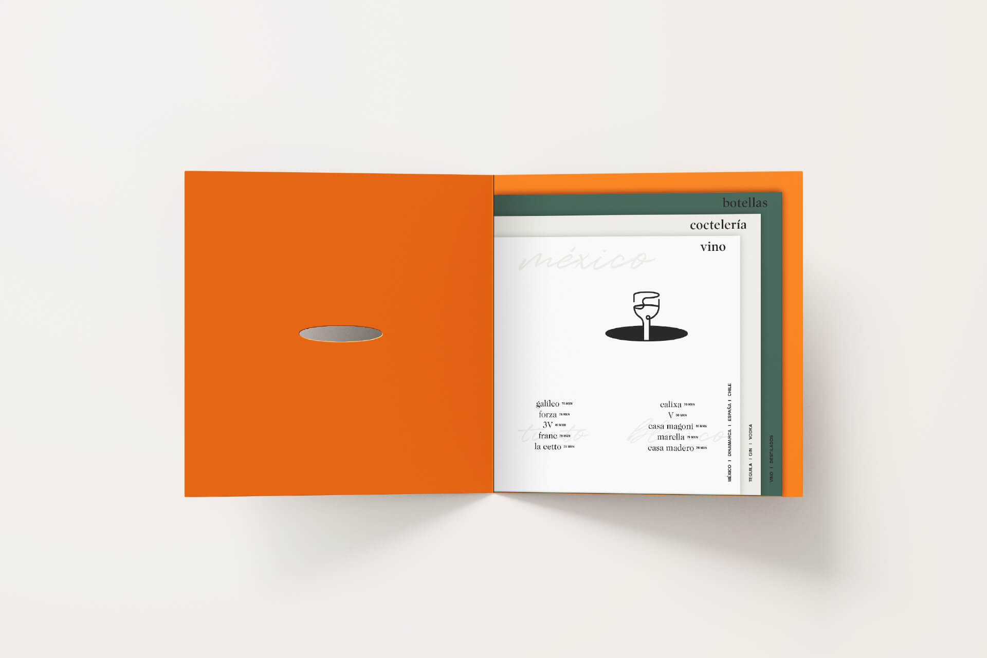
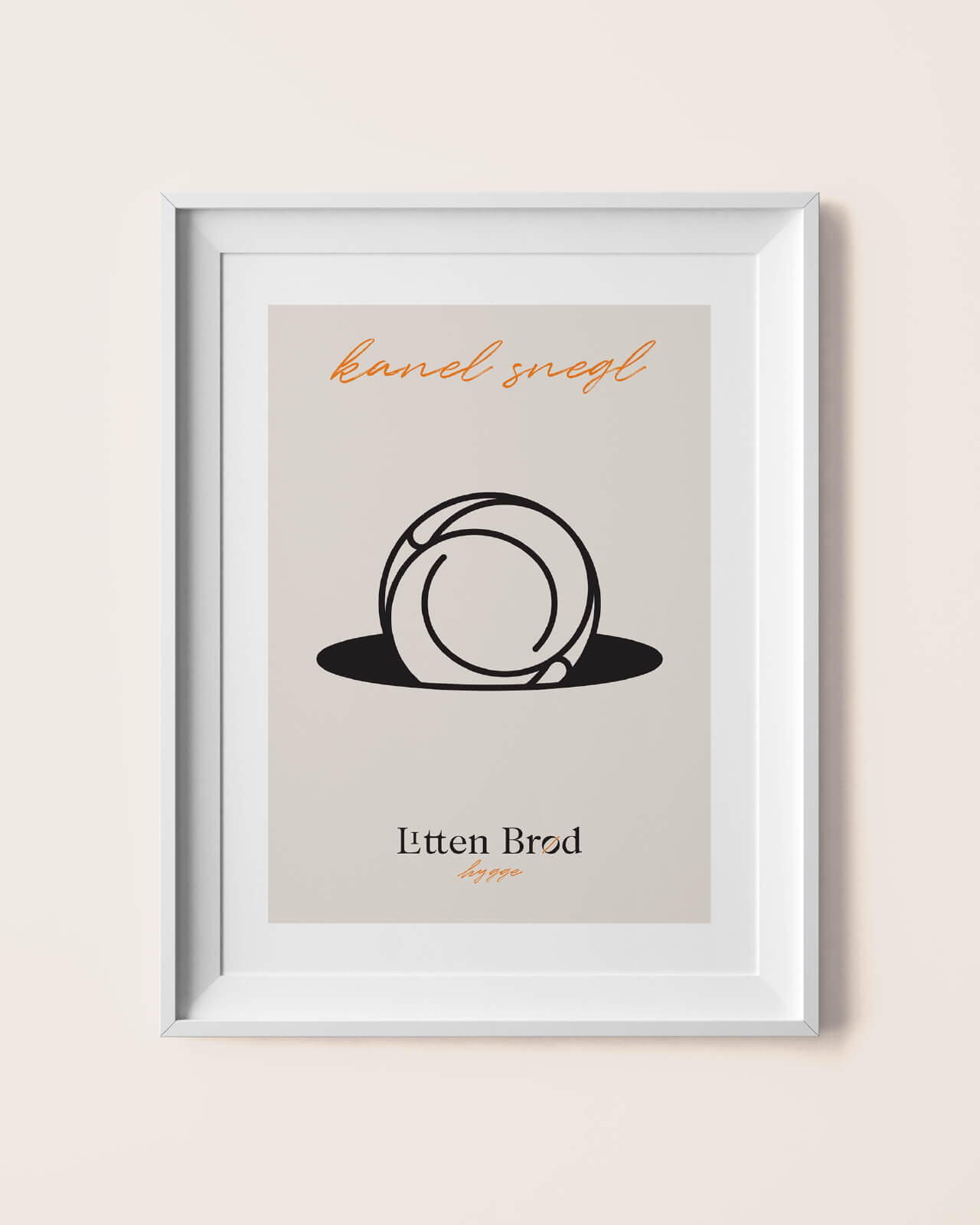
The visual identity combines classic and contemporary elements, reflecting the bakery's appreciation for tradition and its welcoming personality. A warm color palette and a collection of delicate linear illustrations convey the sense of comfort and familiarity associated with hygge.
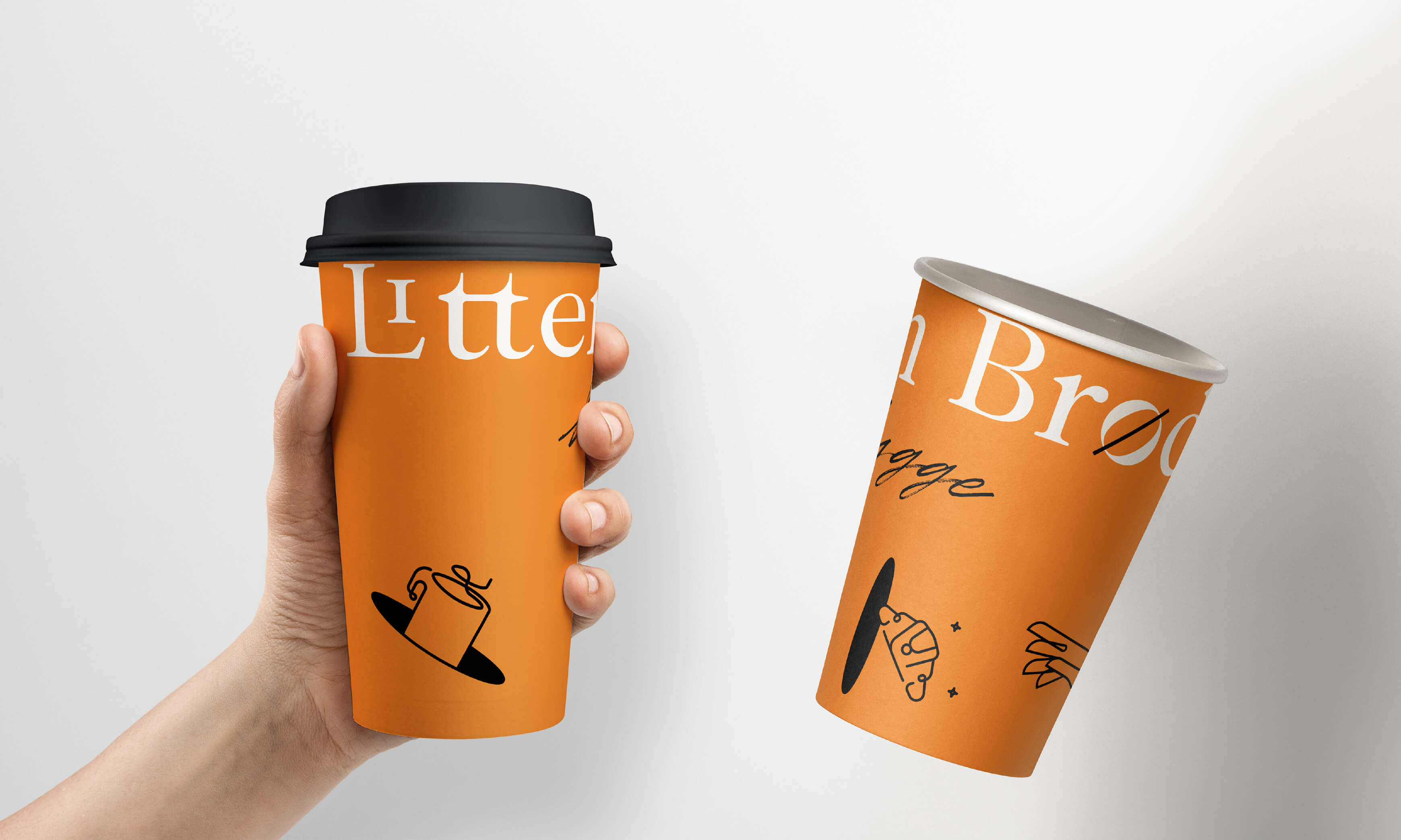
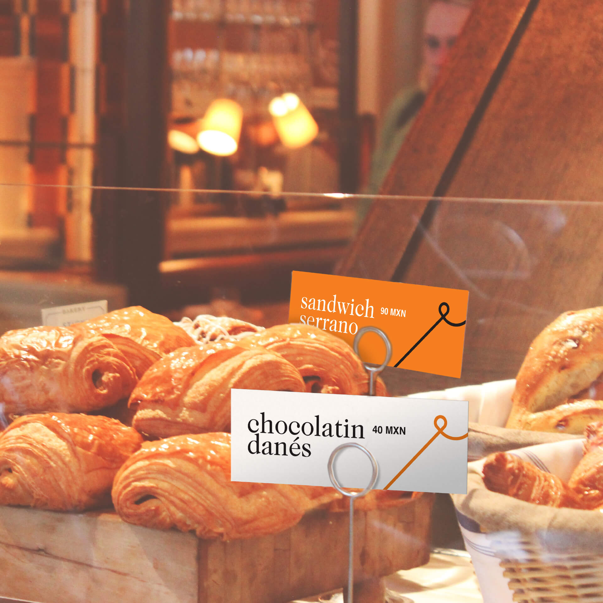
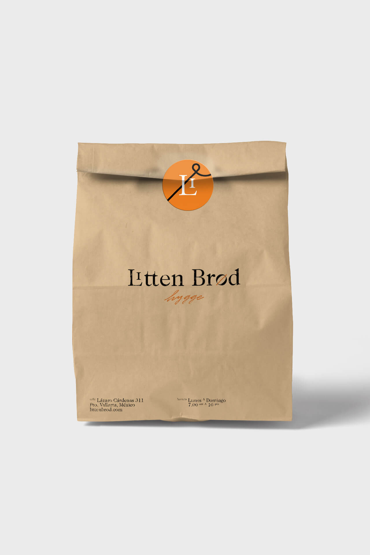
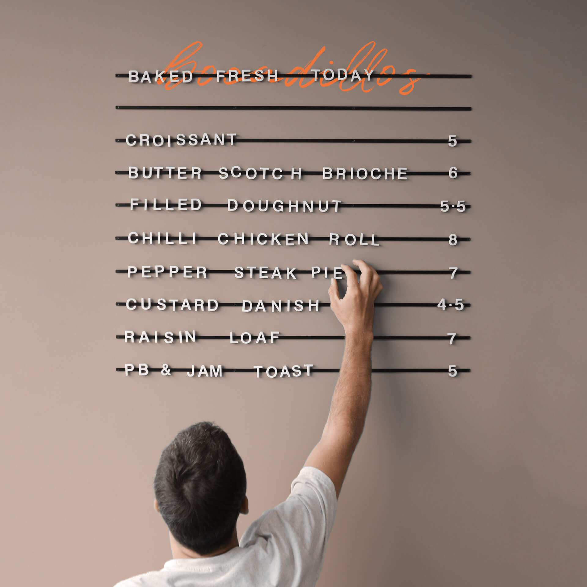
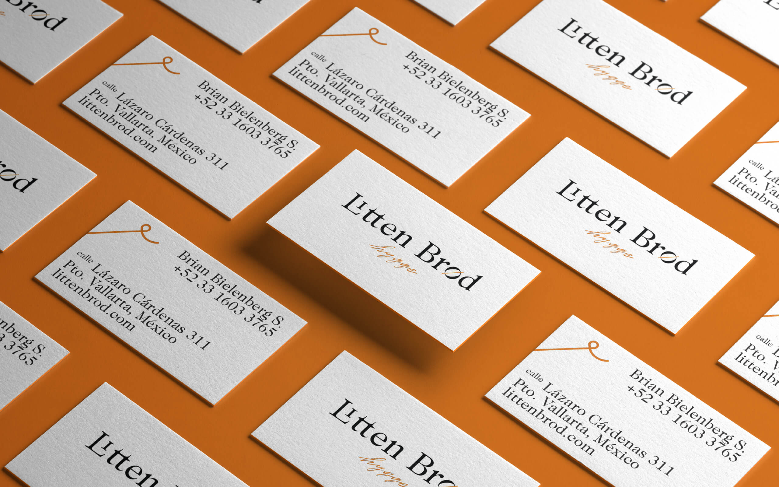
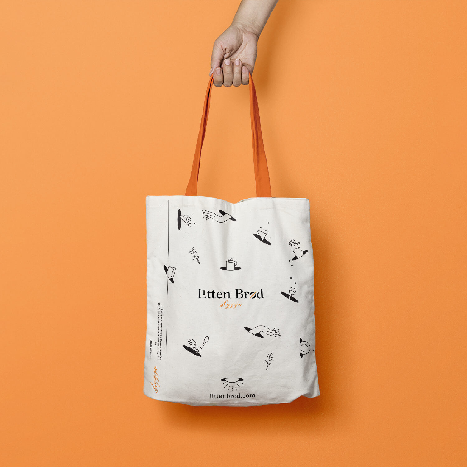
We extended this visual language to takeaway packaging, printed and wall menus, price signage, and other brand applications. Together, these elements create a cohesive and recognizable experience that brings the bakery's Danish character into every customer interaction.