Let’s Talk

A company that offers training and coaching services for human capital also provides workshops and consultancy to businesses. They are in charge of giving training sessions and some forms of therapy to individuals.
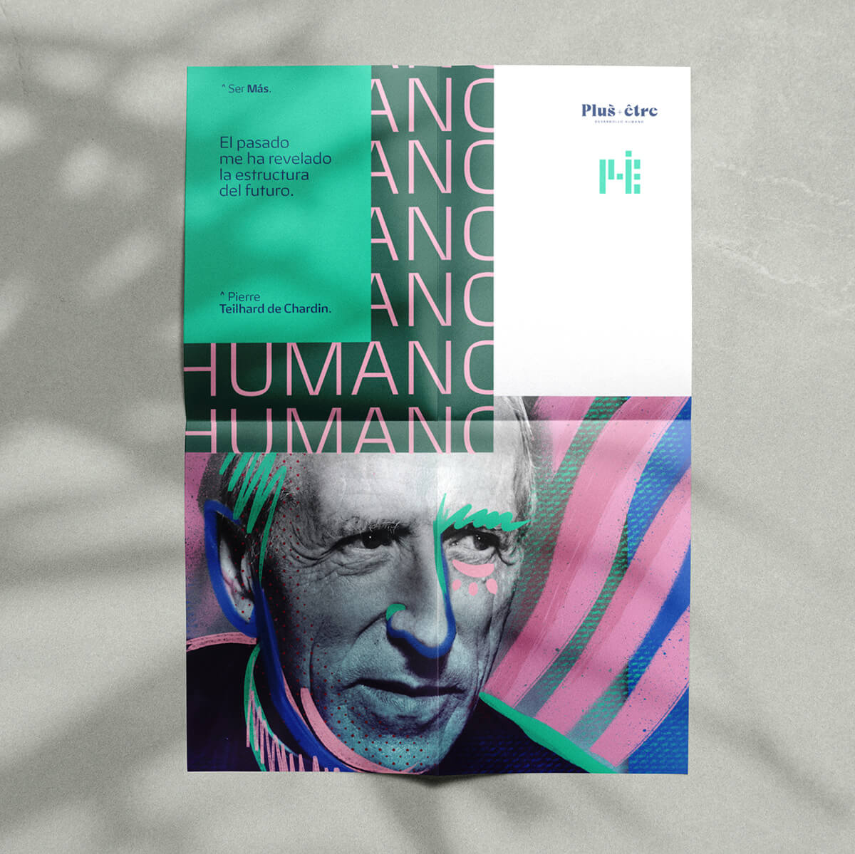
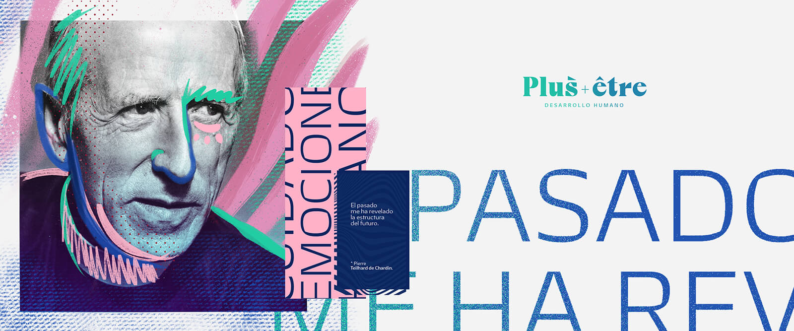
Their techniques go beyond traditional coaching, as they tackle complex topics with practical and easy-to-understand methods. Their ideas are based on the work of Pierre Teilhard de Chardin, philosopher with a Christian-humanistic approach.
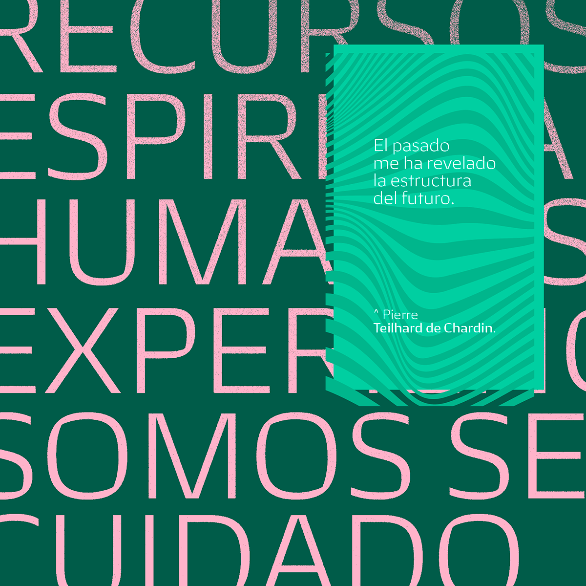
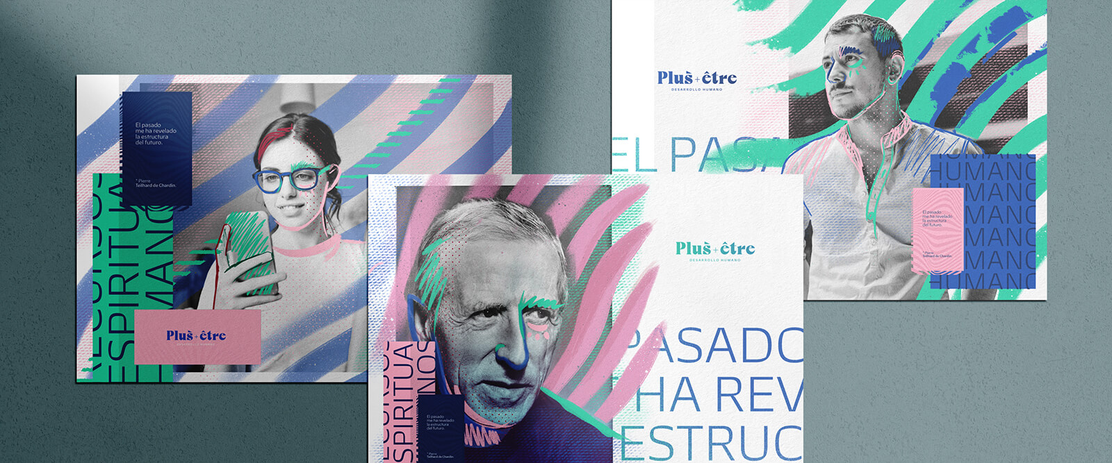
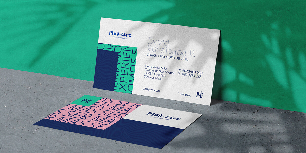
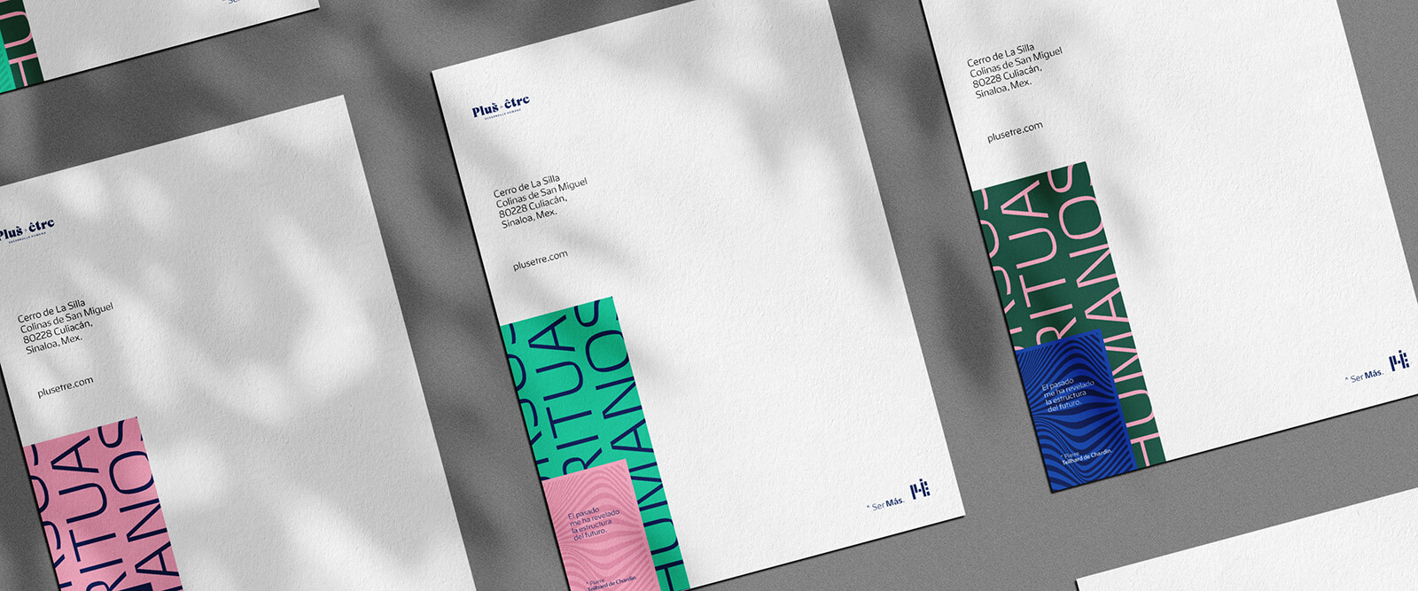
To create a brand identity with striking visual elements, which reflects the values of the company without neglecting the human factor and its work philosophy.
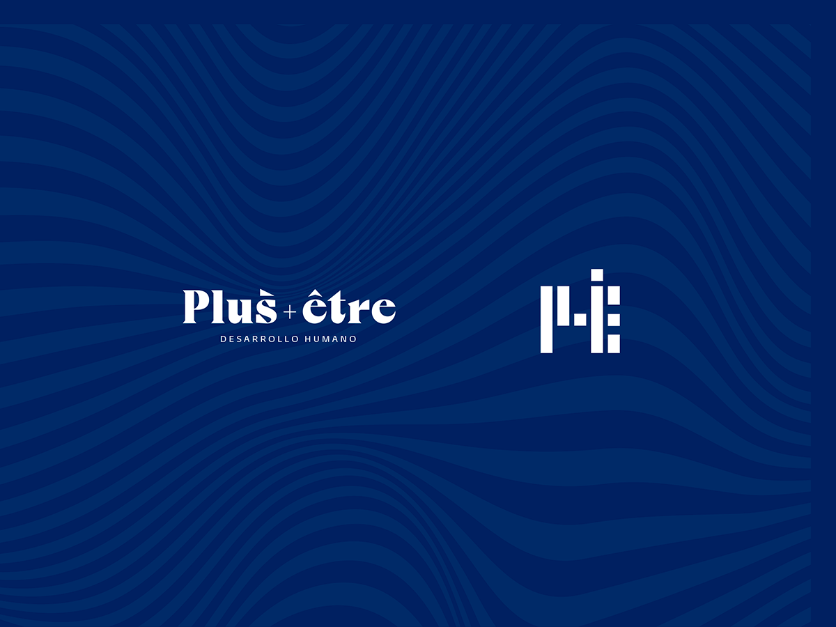
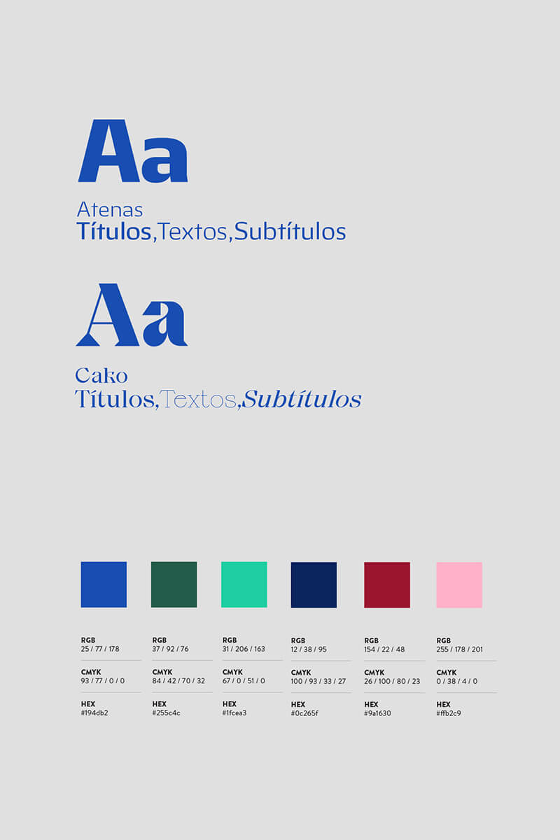
The logo uses a sharp serif bold typeface. The isotype came up from the simplification of the letters P and E, and the color palette is vibrant and full of textures that contrast with the sobriety of the logo.
