Objective
To create a new name and visual identity that would reflect the company's technological capabilities and contemporary approach to business management, while establishing a recognizable brand system for its different software solutions.
Solution
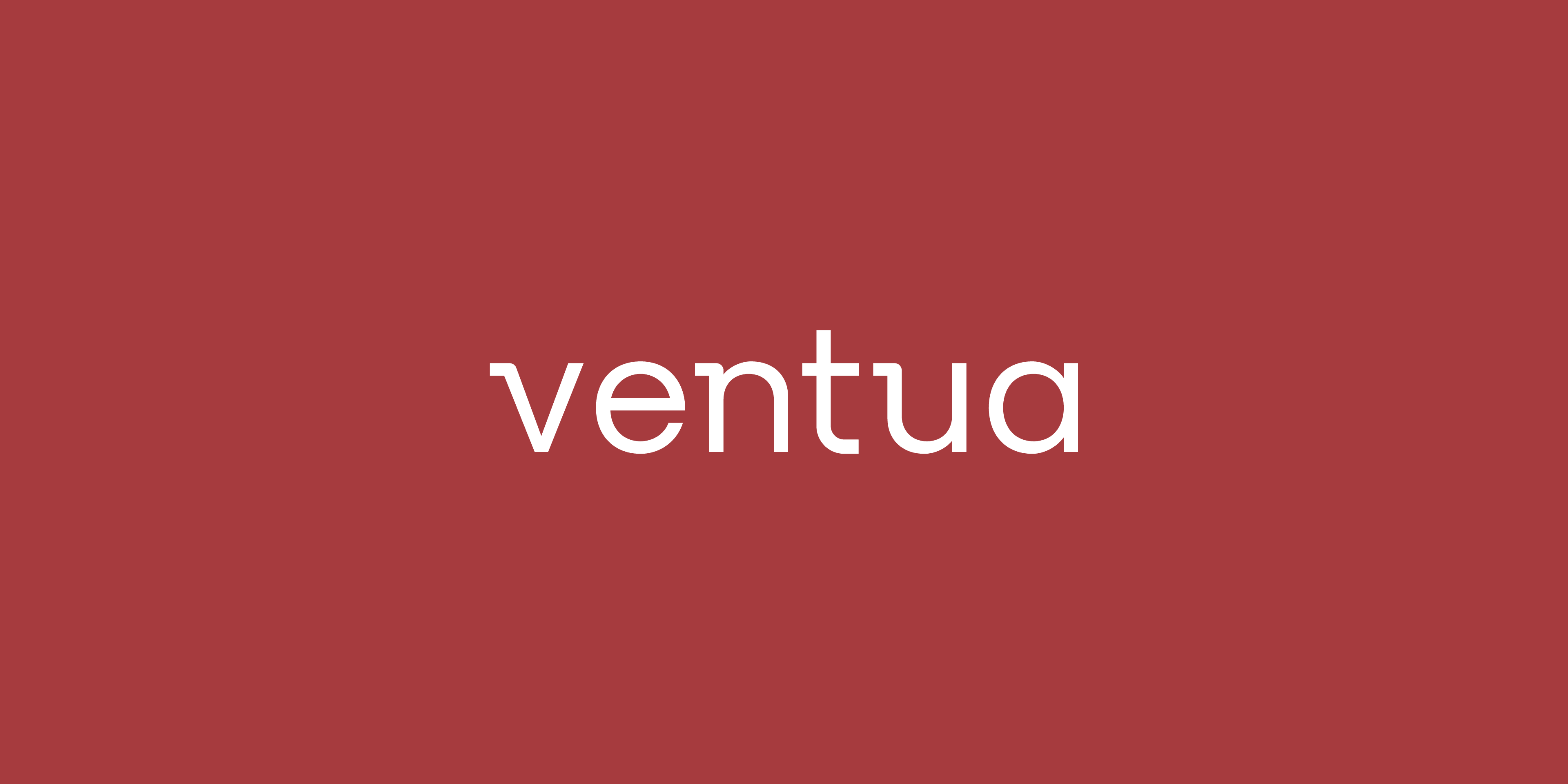
We developed the name Ventua as a concise and distinctive identity for the company, providing a foundation for its renewed brand expression and different product offerings.
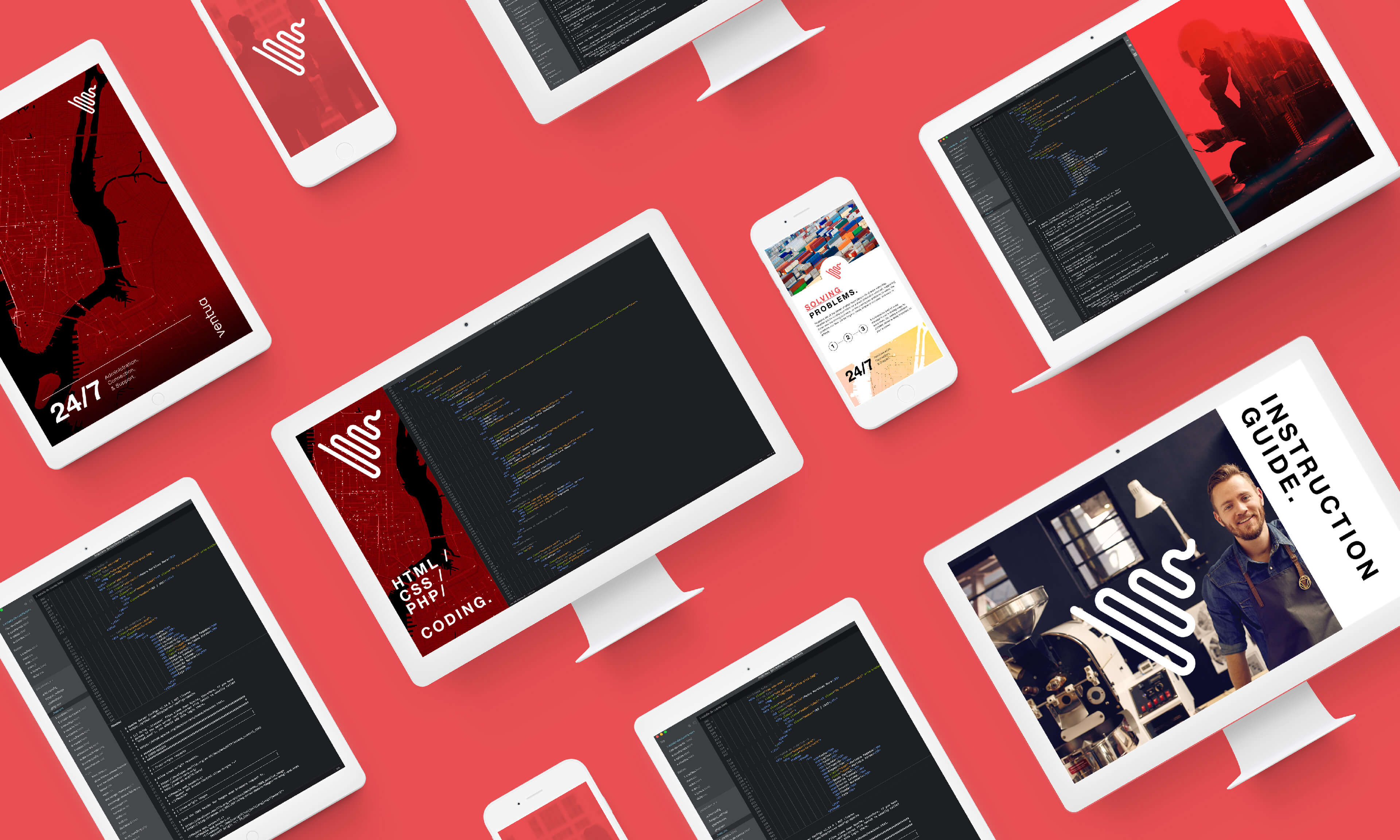
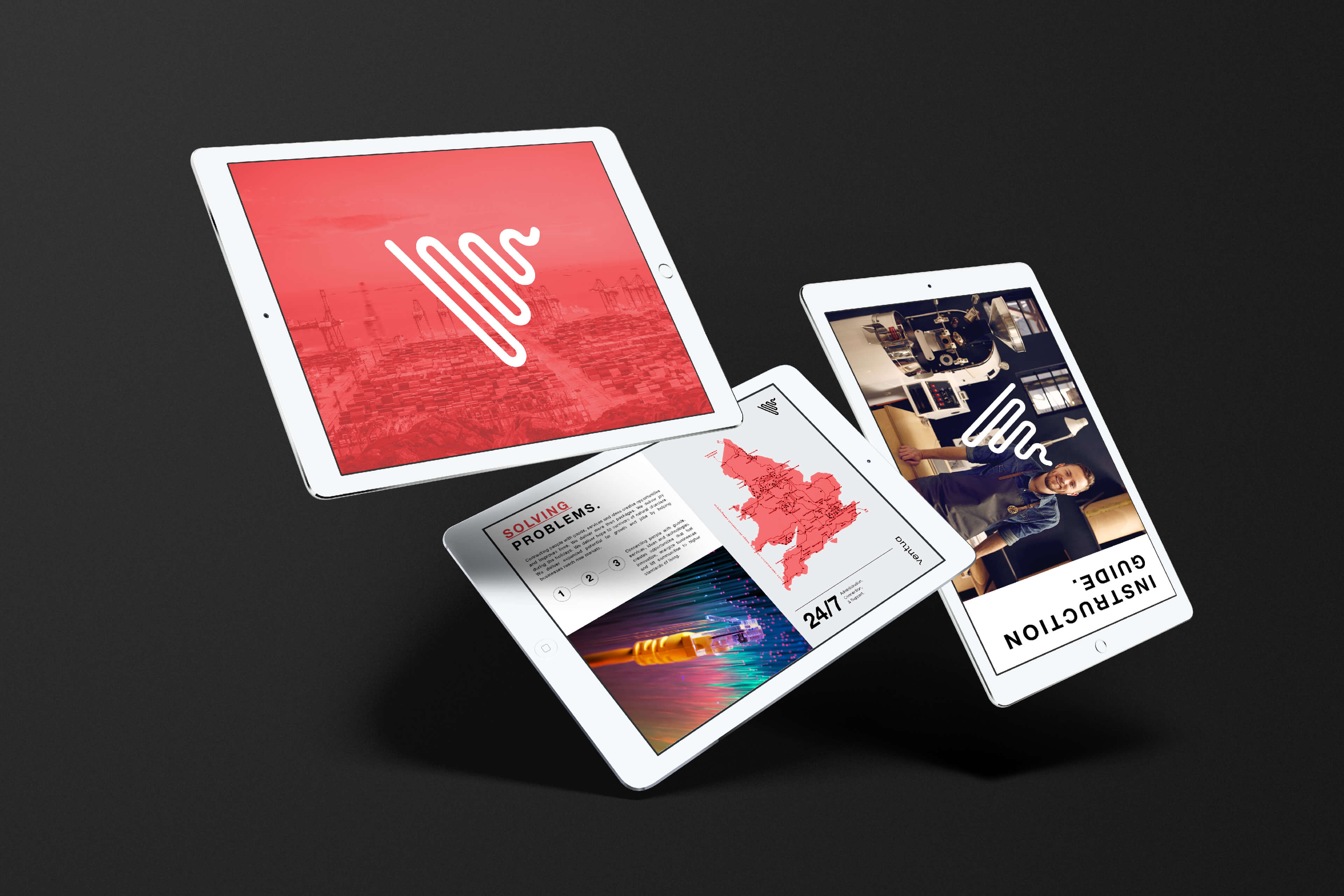
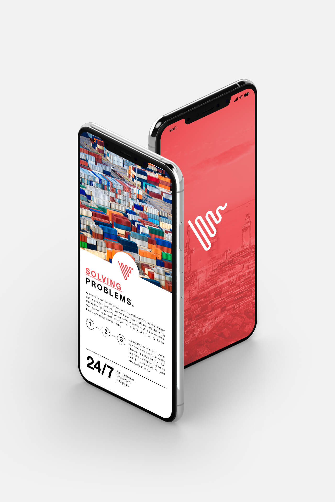
The visual identity is built around a dynamic symbol derived from the letter V, with continuous lines that evoke connectivity and the flow of information. A combination of bold red and vibrant green establishes a contemporary visual language, with the green variation distinguishing the Ventua Cloud product line.
The identity was extended across communication materials and digital applications, including website design, creating a cohesive system that reflects the company's technological focus and makes its solutions recognizable across different touchpoints.